In this assignment I have researched the following eight principles: figure/ground, continuation, closure, proximity, similarity, symmetry, common fate and prägnanz. The assignment also said to choose three of them, and create illustrations for each one by hand.
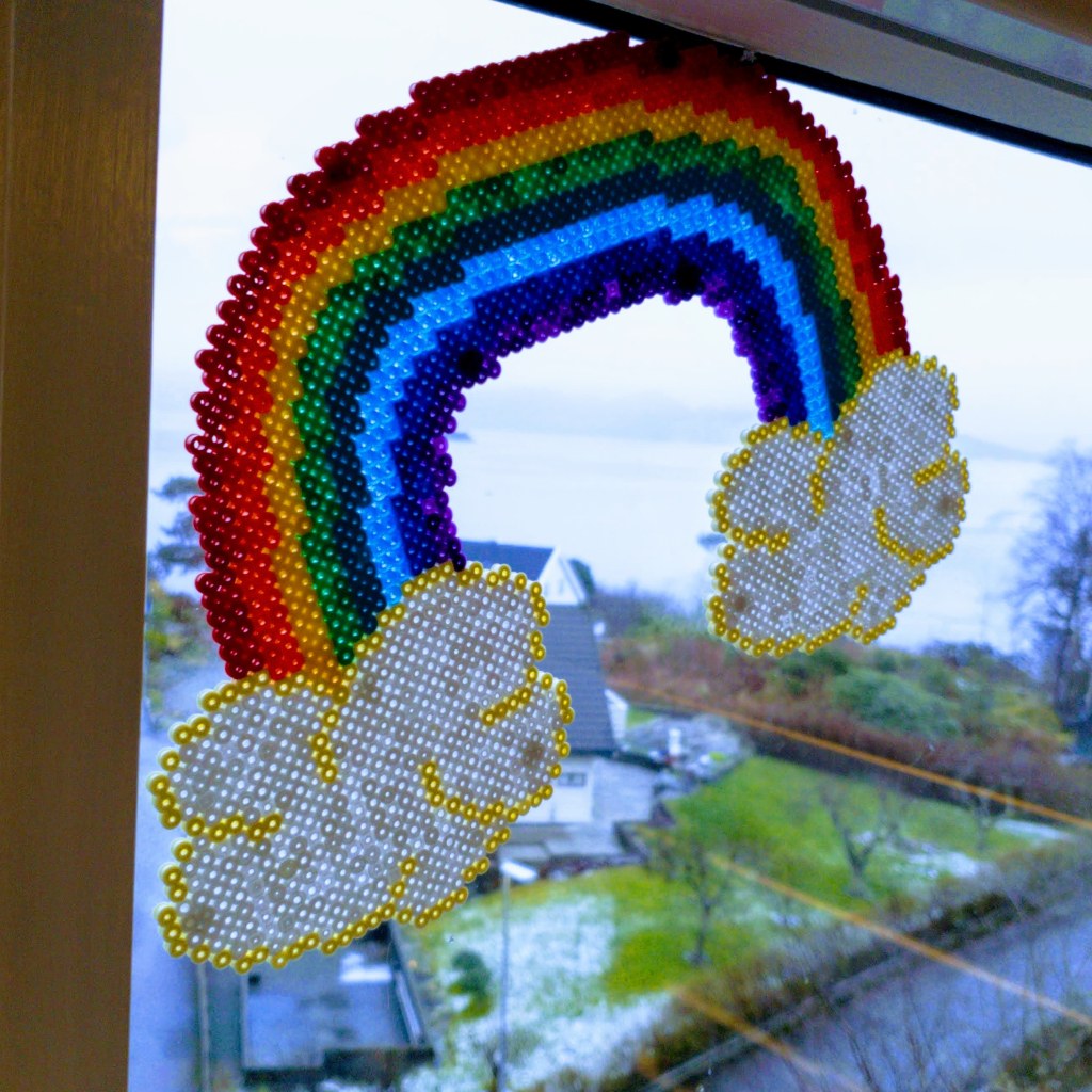
In addition to the given resources: pencil, paper and knife, I have mainly played around with paint and collage techniques. I have made several moodboards, sketched with some help from my five year old daughter, and tested out some of my ideas. Being home a lot with my kids, I noticed that a lot of my inspiration is a bit on the childish and colorful side, but do not worry. I have already made a rainbow these last weeks, so a rainbow is not included in my items, although it is very bright and quite symmetric hanging in my window.
For this assignment I have spent a lot of time online, searching Google and Pinterest, reading a whole lot of articles and collecting photos I found inspiration in. Due to the Covid-19 lockdown in kindergarten, I also have been outside a lot with my kids, walking and looking at my surroundings. I have sketched a lot, and also have received some help in coloring them (before I got the chance to take a photo of them.)
One of the first things I had to do for this assignment was to make sure I understood the different principles we were supposed to research. These are my findings:
- Figure/ground: We tend to see the figure(foreground) first, and then afterwards we identify what is in the background.
- Continuation: We follow and float along with lines, both visible and invisible.
- Closure: We prefer to see whole shapes, and complete lines, and fill in openings in or between elements to see the figure as a whole one, instead of seeing pieces.
- Proximity: We group elements that are close and related into a unit.
- Similarity: We seek out the variables and similarities in a image or shape, and link the similar items together.
- Symmetry: We strive for balance in designs, looking for elements being alike on both sides of an axis.
- Common fate: We tend to see objects moving in the same directions as a group.
- Prägnanz: We like to see complex and advanced shapes and images as a simpler whole.
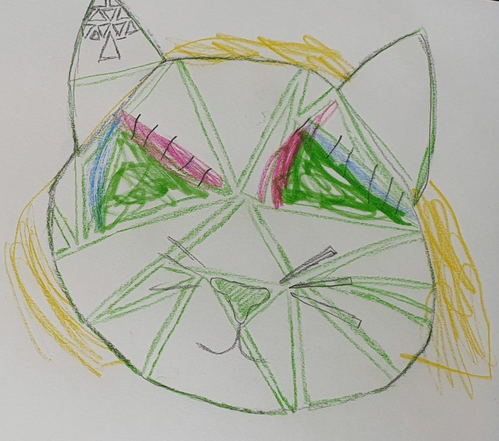
After countless hours online, I made my moodboard for each design principle and started sketching out the three that spoke to me. I chose Common Fate, Symmetry and Proximity. When I looked at my ideas and sketches, I really liked the cat sketch, but realised that it would look better with Similarity instead. So I discarded Proximity and chose Similarity.
The assignment told us to use paper, pencil and a knife. We could also choose any other relevant materials and tools. Our end items should have the measurements of 25 cm x 25 cm, this being quite hard to achieve with regular a4 paper. The solution to this were to go out and purchase a3 paper, both sketching paper, and drawing paper. In addition to the paper, pencil and knife, I used matte and glossy paint, a paintbrush, a tiny paper scissor, glue, an old magazine, a ruler and my lightboard.
I painted samples with my matte and glossy paint on my drawing paper, then transferred my patterns onto the papers, and cut out. I also used cut outs from an magazine for my similarity item, this to add a bit of contrast to my colors and materials.
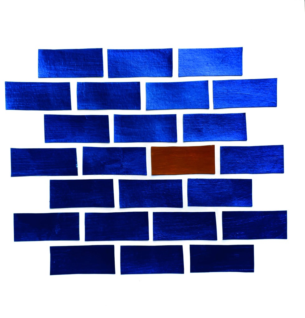
Common fate
My first item is made after the design principle common fate, I tried to keep my work simple without repeating or copying the photos I found during my online search. I thought about doing a piece like my self portrait, that I did for my learning assignment about my journey here, but this is a technique I want to explore and take further with programs like Photoshop and Illustrator, so it will have to wait for another time. Then I thought about Bricks in a wall, they usually all go the same way, and therefore is viewed as a whole unit, even without slabs of concrete in between them.
Traditionally brickwalls are terracotta red, with grey concrete in between. As an illustration I wanted it to be a bit different, and tested out the combination of the complementary colors blue and orange. I ended up with a bit more yellow hue, when choosing the color ochre in matte paint, but combined with the color metallic blue which is quite shiny, I thought the effect of them together were good. The ochre brick adds a focal point for my illustration, and prevents the item from being to monotone.
I made my bricks to the measurements of 2,5 cm x 5 cm, and the spaces between should be 0,5 cm. I placed them in a 3-4-3 formation on my paper, starting and ending with a row of 3, to prevent it from being unbalanced or to top/bottom heavy.
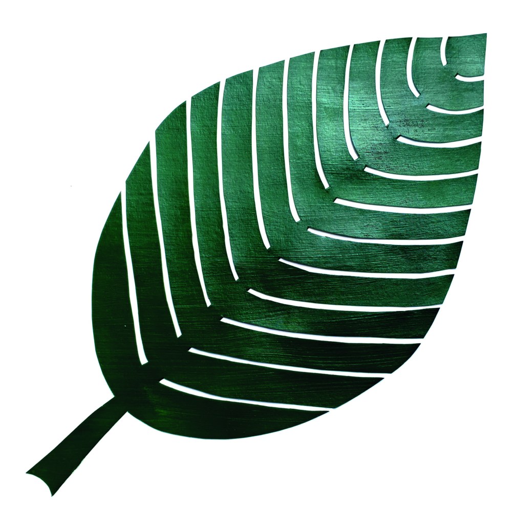
Symmetry
My second item for the Symmetry principle, is a huge green leaf. I was thinking about different ideas, one of them being a rainbow, which can be quite symmetric. During the last couple of weeks, with the Covid-19 situation, the rainbows are everywhere. So I have already made a rainbow with Hama beads, and then I wanted to do something different.
A green leaf is perhaps not the most innovating choice, but I chose to do the leaf anyway, due to the challenging small gaps in the leaf, and the beautiful contrast between the green leaf and white paper.
I chose this color of green paint because of the richness of the color. As for my common fate item I could have chosen a unexpected color and experimented, but for this one I wanted to keep it more on the basic side, and still get an effect of the dark green against the crisp white of my drawing paper. The green is painted onto a big sheet of paper, I transferred my drawn pattern onto it, and cut away.
I placed my leaf in the middle , turned diagonally across the paper, to avoid it from being to symmetrical. So this is my symmetrical yet unsymmetrical green leaf.
Similarity
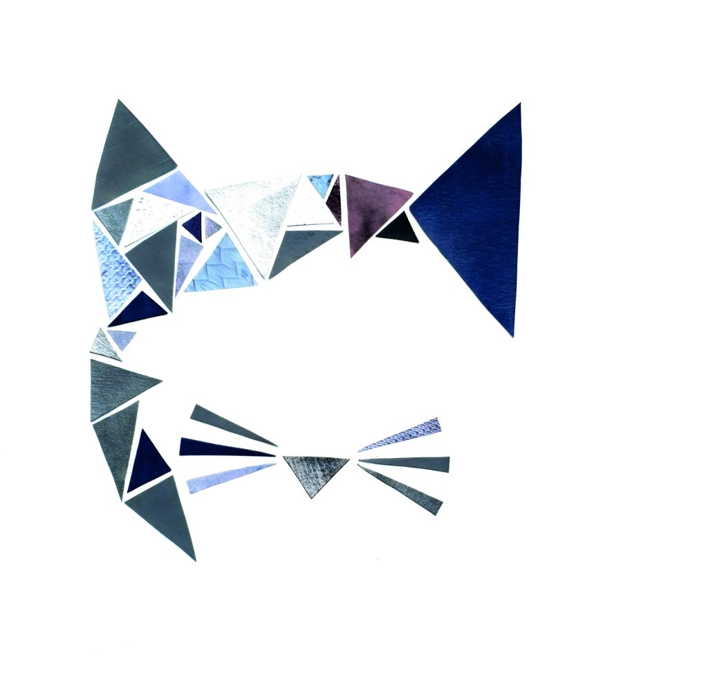
My third and final item is a cat made out of triangles, for the similarity principle. As I mentioned before this initially started out as a proximity sketch and idea, but when I started drawing it up more detailed, it appeared to me that my idea actually was a similarity idea, not proximity, so I changed it.
The color choice for this illustration is different hues of grey, from light silver, to a dark grey. Most of my greys are a bit on the blue side of the color scale, adding depth to the illustration. I painted four different greys on my paper, as well as a see-through with grey glitter inside. For extra variation I cut out different items in grey from an old magazine, some of these have patterns on them, making them extra fun to add contrasts to my cat. I then cut out all my large and small triangles in different colors and patterns, and started gluing them on my paper, in my predefined pattern.
The different greys work well together, adding a bit of whimsicality to the strict triangles.

Én tanke om “MA01 – Design principles”