The third and last learning activity these weeks is about the Unilever logo, and the Gestalt Principles we worked on in Ma01 – Design Principles.
Assignment 1: Look at the following logo and consider the shape, form, simplicity of design and the way it communicates.
The Unilever logo is a brilliant way to express all the things Unilever as a company stand for. The U-shaped logo, is built up by 25 different icon, where each one has a meaning for Unilever as a company. All the icons have been simplified, some almost into an abstract version, others are easier to recognize. This without making the logo messy and distracting to the eye. After researching and reading up on what Unilever as a company stand for and want to do, I think that choosing the color blue as their logo color is great. Unilever seems like a company that wants to do good, and help the earth and the people on it. The blue color make the logo come across as calm and trustworthy. It also helps tidy up and neutralize the effect of all the different elements of the logo, making it easier for the eye to see it as a symmetrical whole.
Assignment 2: In your own words explain what you consider the different Gestalt principles in this logo to be. Describe the logo and justify your answers.
For me the Unilever logo is mainly built up by the Gestalt principle proximity. All the icons making up the logo, are placed tightly together, helping us see this logo as a whole. I also think prägnanz had a little play in it, making up the simple shape of a U, with the simplified icons.
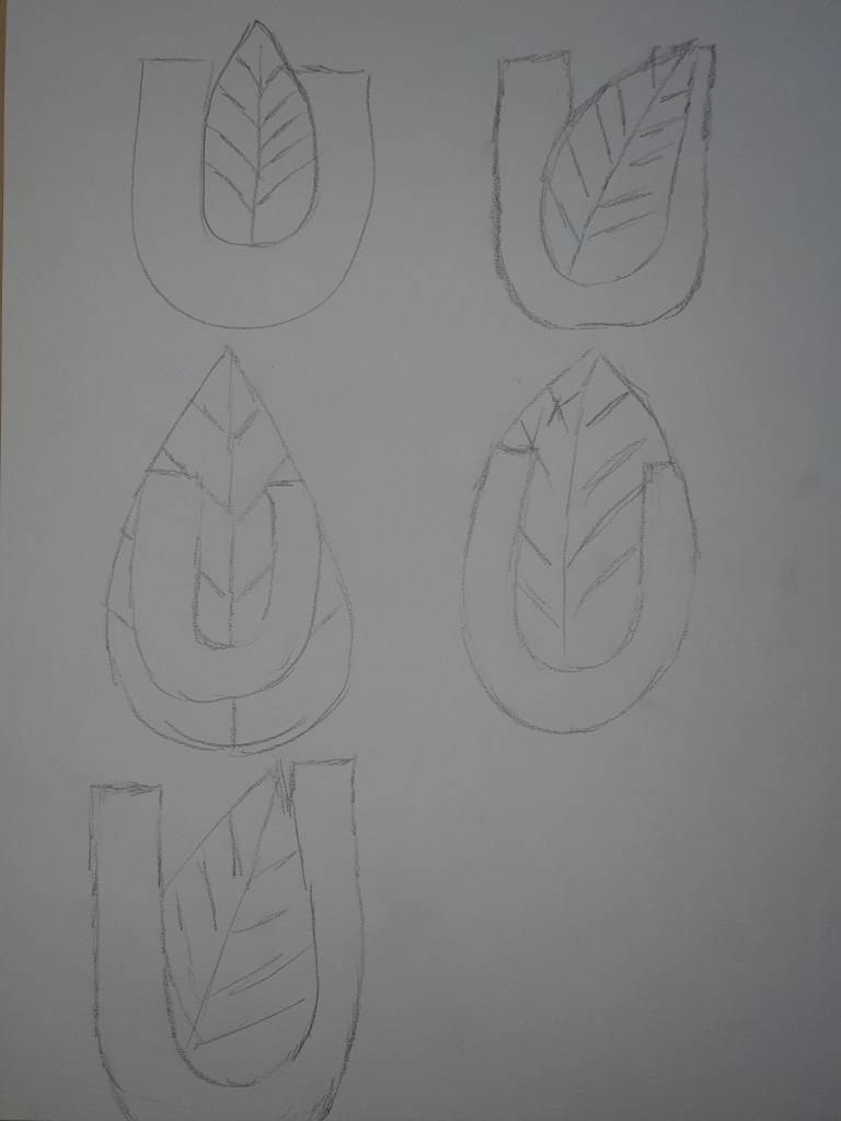
Assignment 3: Pick any 3 Gestalt principles and recreate 3 versions of the logo according to your chosen principle. Be creative and innovative with how you do it. Sketch, plan, and do it by hand before digitally creating your favorite option in a vector format.
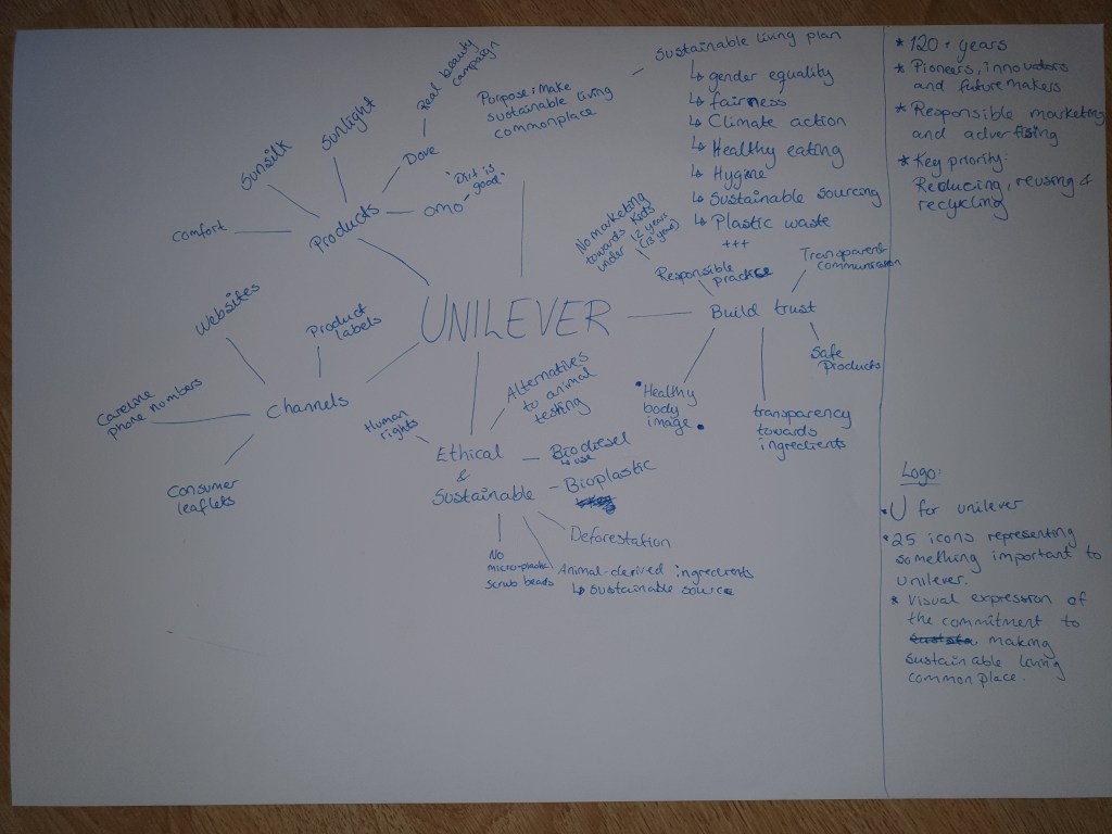
At first I was unsure what direction to take, and started out researching Unilever as a company, finding out more about them, making a mind map over their values and what they do. Gaining insight before researching inspiration in a mood board. As Unilever states: «Our purpose is to make sustainable living commonplace.»

Finally I were ready to start sketching, I doodled and tossed out different ideas. All I knew, was that I wanted to keep the U in some way.
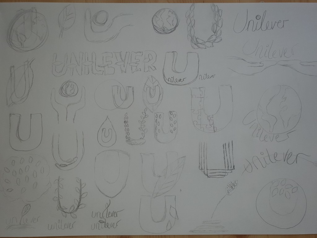
I chose three of my ideas that spoke a bit extra to me, and tinkered a bit more on them, before I made my choice.
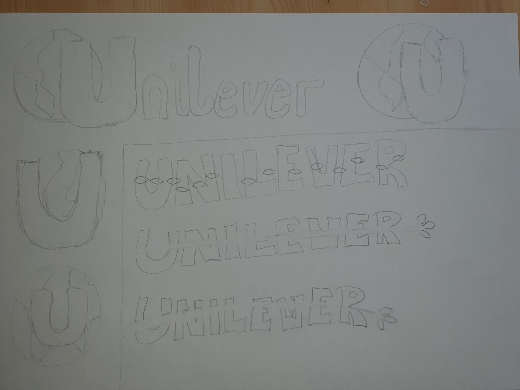
I ended up choosing the following Gestalt principles: Closure, Continuation and Figure/Ground. The designs of my logos are maybe not the most innovative this time, but makes a good practice for assignments to come. When loading my designs up to the blog, my colors, that in Illustrator seemed a bit bland and boring, suddenly was a lot brighter on the blog. I actually like them much better here on the blog.
Closure
For this logo, I played around with the U balancing on the earth, I settled on having it on the right side, making an open space on the U’s right side. I simplified the earth from my original idea, it just got to busy in the little space behind the U.
Continuation
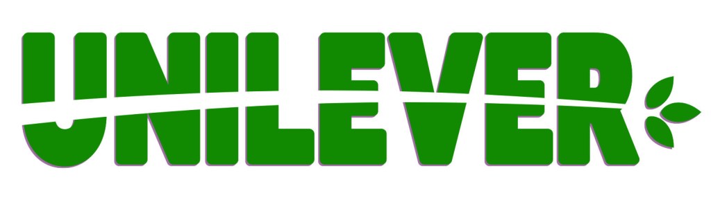
Inspired by Unilever’s work against deforestation, I made a sprout go through the logo name. The three green leaves on the end, represent one of Unilever’s key priorities: Reducing, reusing and recycling. For this logo I chose a color of clear green, suitable with the leaves and forest theme.
Figure/ground
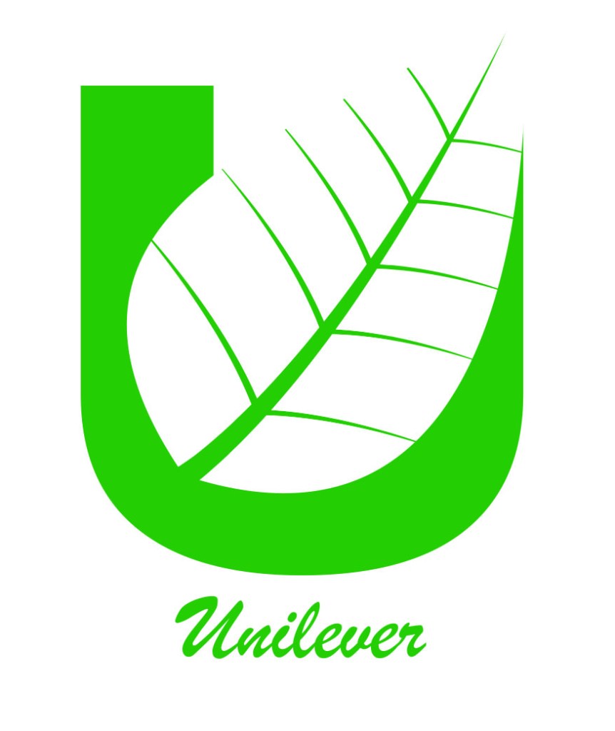
For this logo I wanted the U to be the background of the leaf, placing the leaf leaning towards the right preventing it from being totally symmetric and adding some edge to the design. I went with a bright green to color this logo.
Sources
