The first part of our learning assignments this week was to create a new word. This was to much fun, in our house we make up words all the time. As an example, when my oldest was three years old, her favorite rude word was to call people «Skinke patruljebåt.» That translates into calling people a Ham patrol boat. We also have a word replacing attention or oppmerksomhet in norwegian, asmest. So you see, the bar is high when assigned to creating new words. I actually wrote down four, and played a bit around with them:
- Juppy – A combination of jump and happy, a word of joy, almost like jippi(norwegian) or yay.
- Filap – A word for messy.
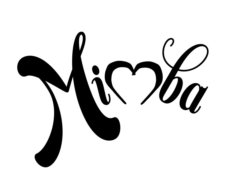
- Mimba – A word for a good looking person. (Could also replace a combination of sexy and cute.)
- Wilatonky – «She’s wilatonky!» A word for silly, goofy or fun.
After sketching and thinking on the different ideas, I chose Mimba from my new words.
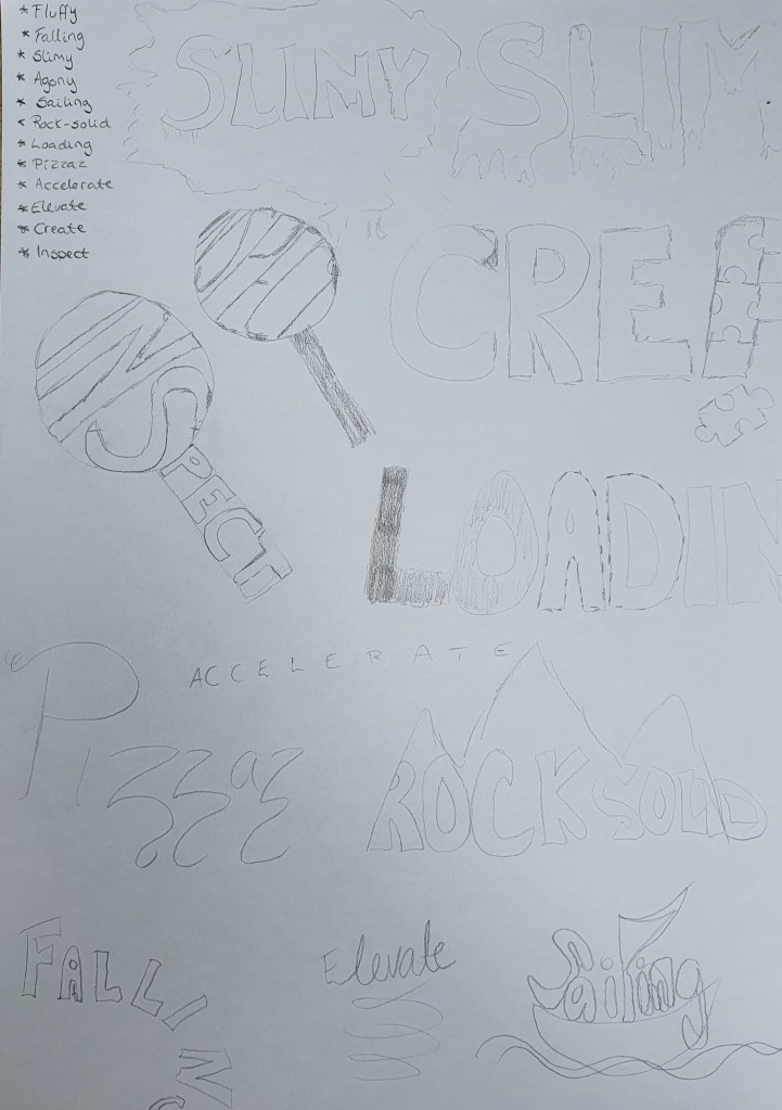
The next part was to choose two extra words from the following words:
- Fluffy
- Falling
- Slimy
- Agony
- Sailing
- Rock-Solid
- Loading
- Pizzaz
- Accelerate
- Elevate
- Create
- Inspect
I found it kind of difficult to choose, so I tinkered on several of them. I tried out different ideas, and ended up choosing Inspect and Loading.
The last part of our first learning assignment this week was: «Create three different compositions, showcasing your three words, one word per composition. In each composition, arrange each individual word to express its meaning, using only the colours black and white. Consider all and any means at your disposal: dramatic scale contrasts, cutting, repetition, letter spacing, etc.Each composition should fit onto an A4 format. You can play with the size, spacing, placement and orientation of letters while being cognisant of how the word(s) interact with the entire format.Consider the entire format as an important design element: use all available space; don’t simply centre the word – think of this as an opportunity engage the viewer throughout the entire layout. Experiment. Play. Push to the edges of the page. Repeat elements if it helps to get the meaning across. Choose a very simple creative solution, if you find this direction more appropriate.Make sure to only use one typeface for each composition, noting the suitability of the choice of typeface to the individual word; you can experiment with various styles (light, bold, condensed, uppercase, lowercase). You may repeat, omit, slice, block or overlap words or letters.However, please do not use drop shadows or similar computer-generated effects.»
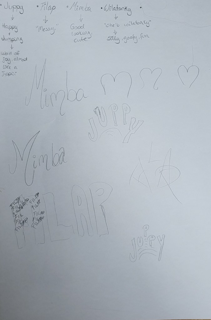
After sketching and drawing in Illustrator, I also wanted to draw up Filap.
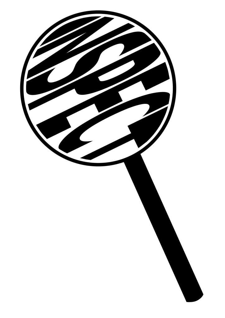
Inspect
For this illustration I ended up with the design of looking at the word through a magnifying glass. The illustration of inspecting the word Inspect.
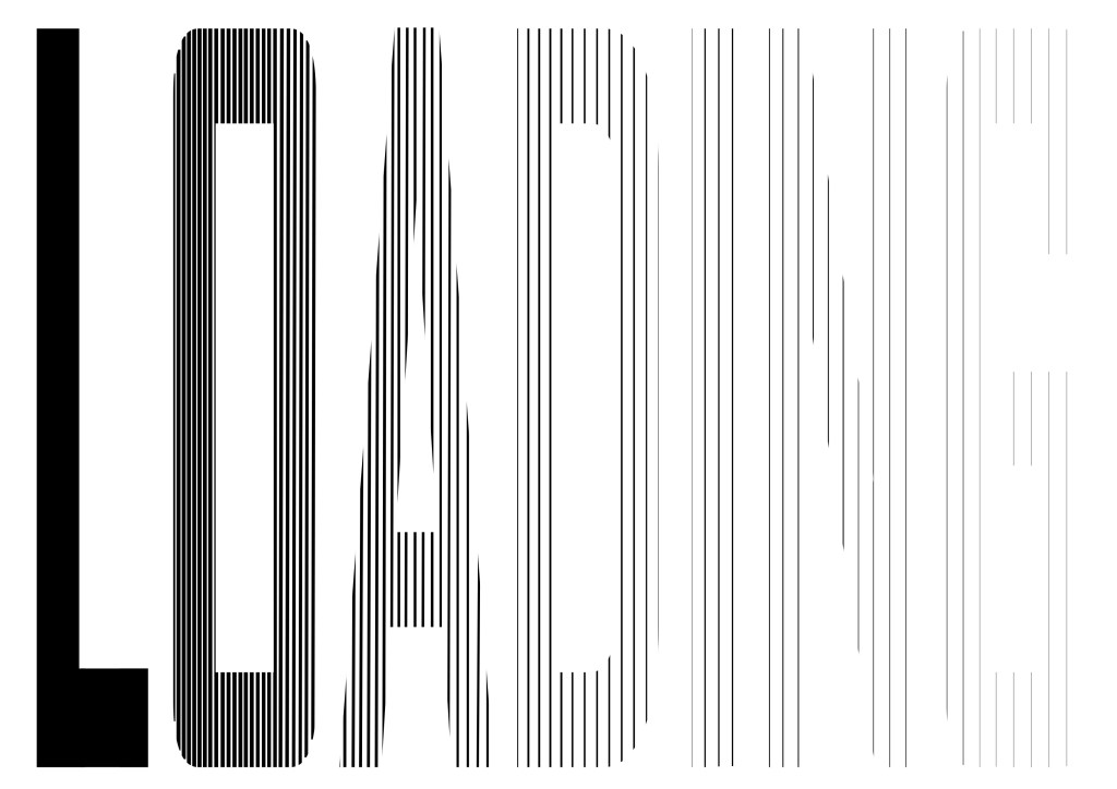
Loading
My loading illustration is made up with lines, except from the solid L. The lines gets thinner and thinner, and the spacing between the lines wider and wider. Making the word filling up, and load from right to left.
Mimba
For the illustration for Mimba, I wanted curves and flowing feminine lines. The m in the middle is made different from the other ones. I made the m based on the shape of a heart. But if you flip it upside down, you get a body part, which I will leave unnamed.
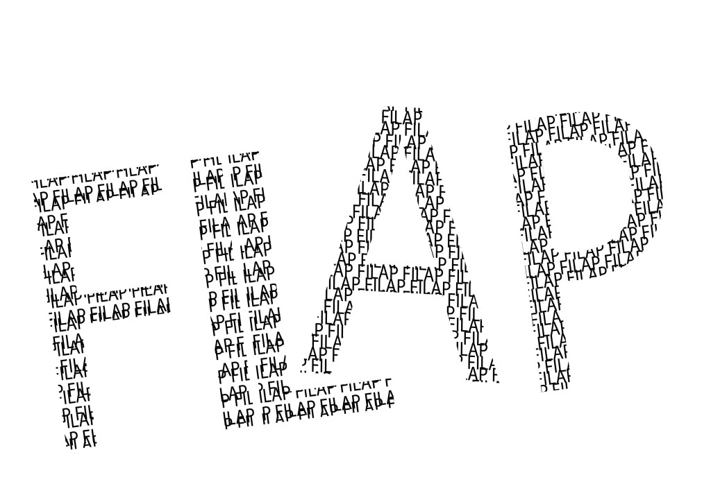
Filap
For the Filap illustration, I wanted to make a clean mess, if that makes sense. I made the letters with two sets of the word written all over, and tilted one of them, to create some messiness. I have arranged my letters with uneven spaces between them, and tilted some of them in different directions.