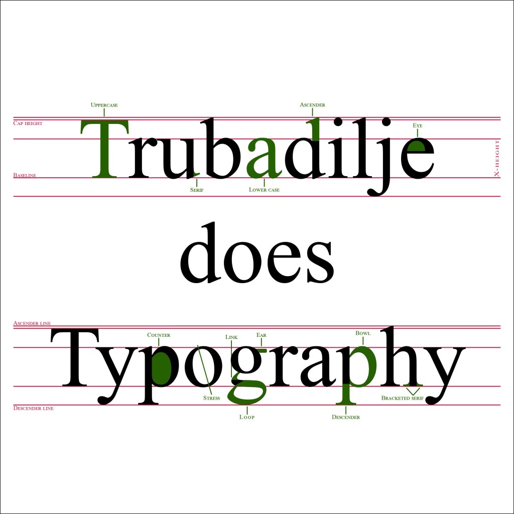
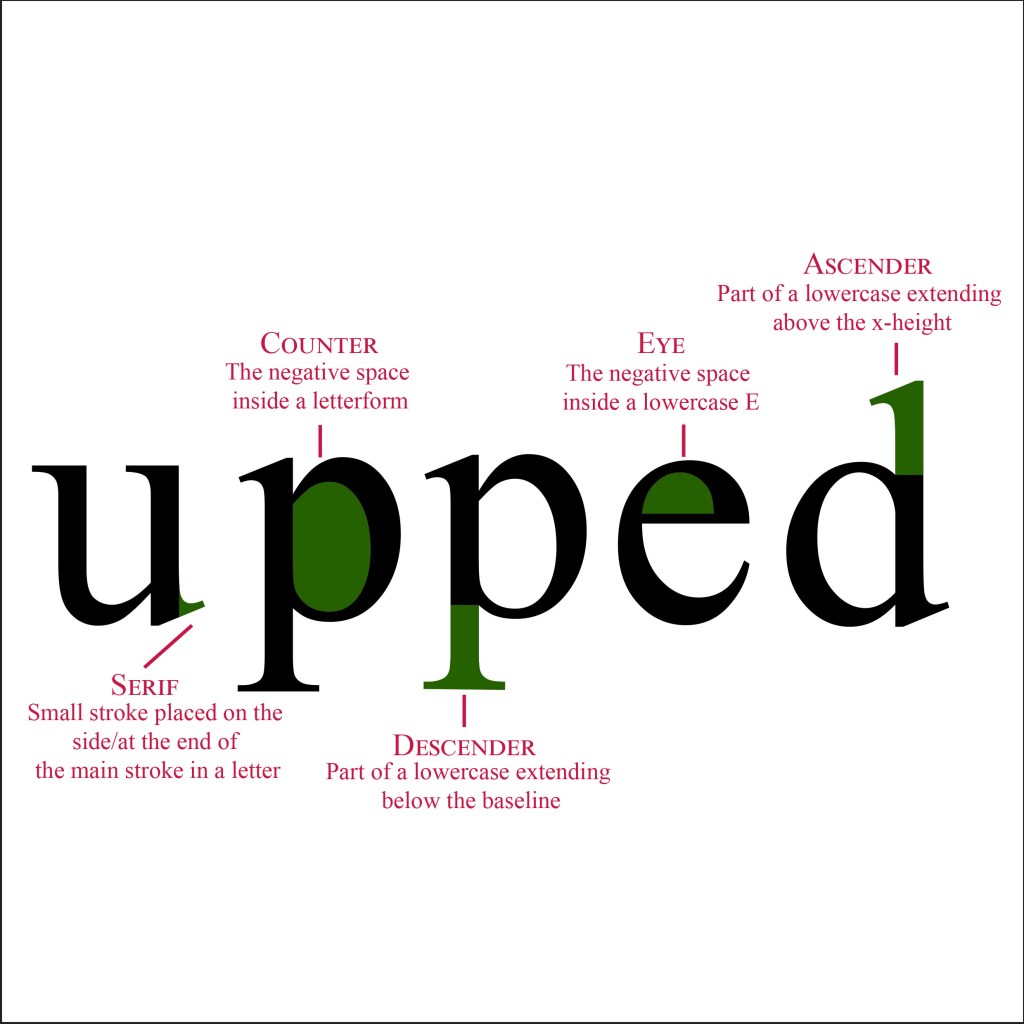
Our second learning assignment this week told us to explain the anatomy of type in a visual way. We could either use one typeface, or up to three different ones. The colors was limited to using only three different ones, but we could choose the three ourselves. I chose to use Times new roman for this assignment, this is a well known typeface, and it used to be my favorite one when I was younger. Here is my take on the visualization: