Our last assignment this week was to design a book cover for one of these books:
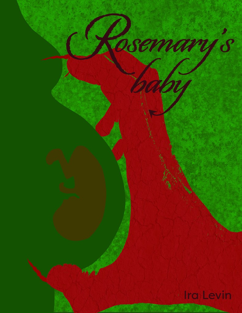
- “Rosemary’s Baby” by Ira Levin: use complementary colours to express anguish and uncertainty.
- “Animal Farm” by George Orwell: use analogous colours with a contrasting accent to express disagreement and discontent.
- “The Secret Garden” by Frances Hodgson Burnett: use secondary colours to express naivety, honesty and harmony.
I chose to do «Rosemary’s Baby.» Red and green are the perfect complimentary color set for this one. Here are my color theme:
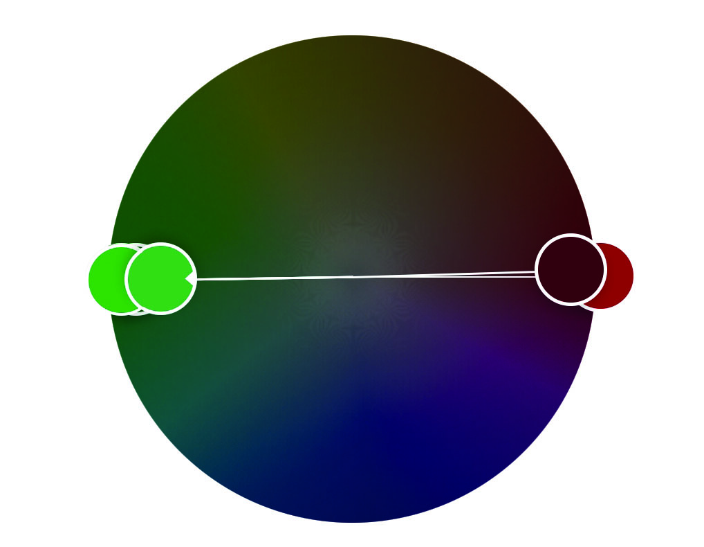
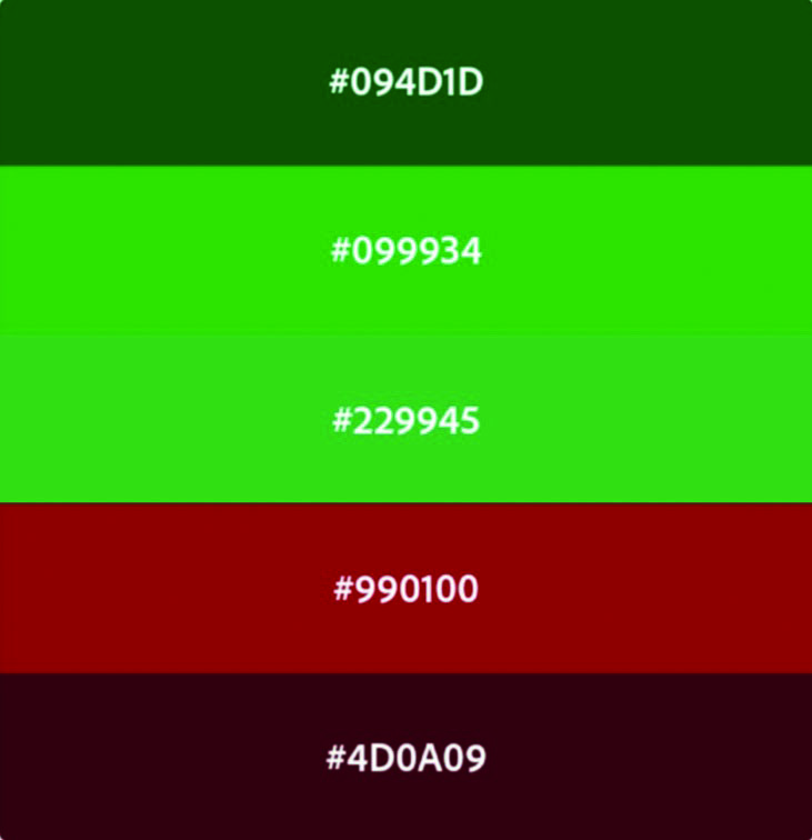
I had actually heard of the movie, but have never seen it before, so I had to start this assignment with researching the book, and figure out what it was about. I went for a creepy but not splatter kinda theme. I have played around in Photoshop and Illustrator for this assignment. I did not use all the colors in my theme. Two of them were pretty similar in the end, so I used only one of them. I have also tested out some patterns, and different levels of opacity to get effects without using a whole bunch of colors. After drawing this, I think I have to read the book. I guess it could do as some good summer reading? Anyway, here is my attempt at a book cover for «Rosemary’s baby,» enjoy: