«Take a magazine, newspaper or book that includes images and text. Lay tracing paper over the top of three spreads (both left-hand and right-hand pages). Using a pencil and ruler, carefully trace the grid underlying the page layouts. Remember to remove specific text elements or images, and to only draw the grid lines. Note column widths and margin sizes at the top, bottom, and to the left and right of the main body of text. Is your document based on a two-column, three-column, or another type of grid? Which elements stay the same on each page, and which change?»
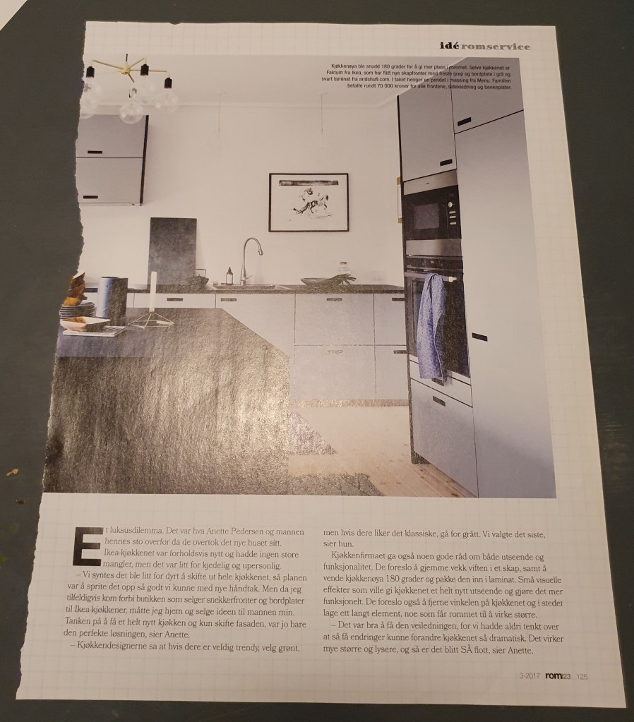
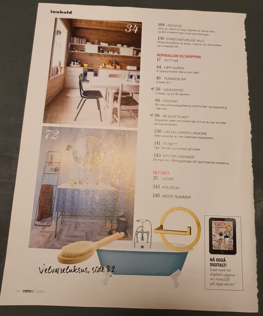
I chose to use an old magazine that I found at home, called Rom 1-2-3 from 2017. Here are my chosen pages and drawings:
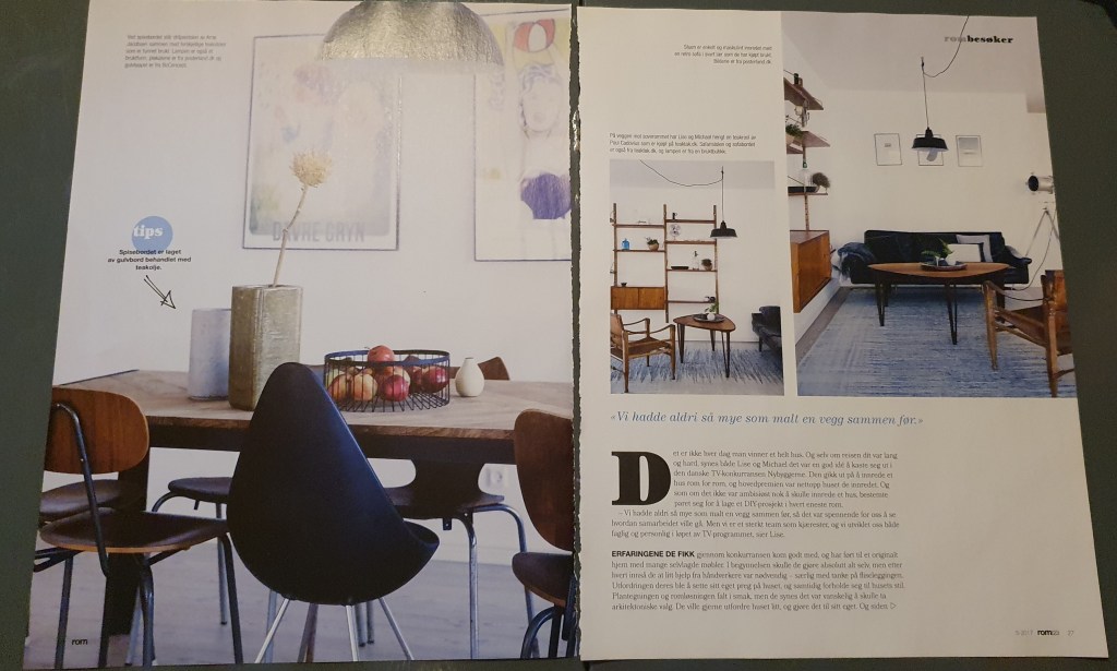
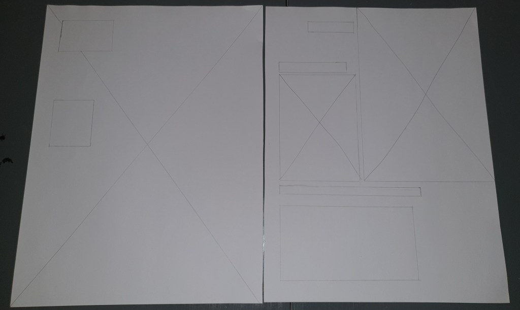


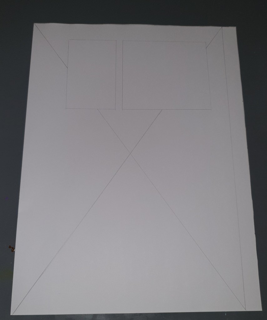
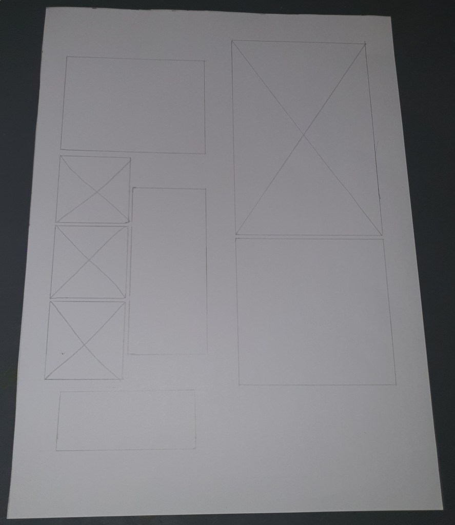
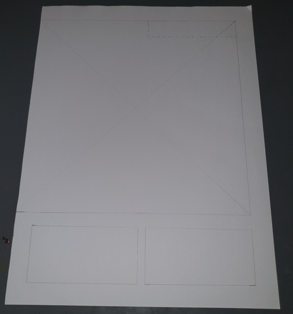
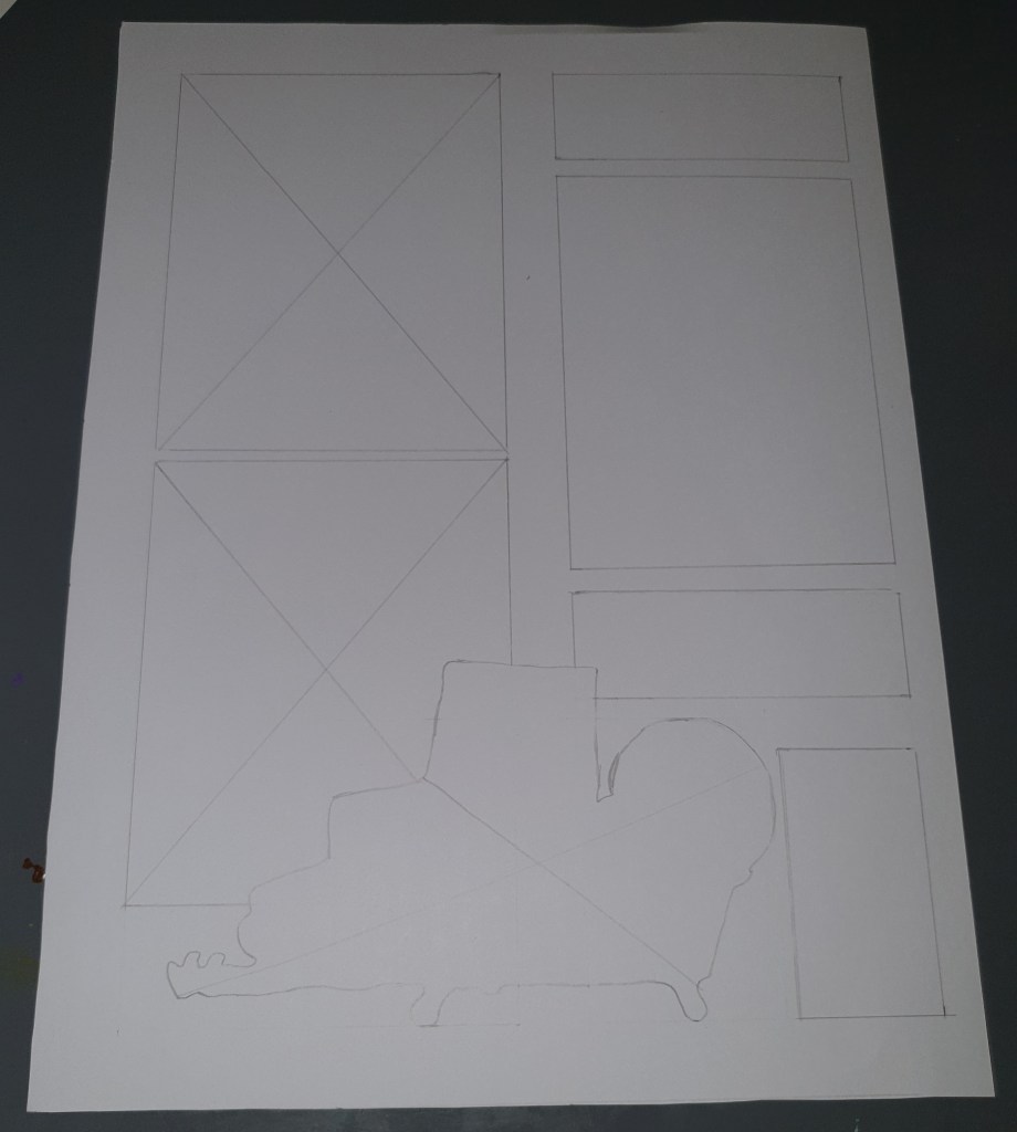
The interesting about this magazine and the pages chosen was that there is a whole bunch of different looks and sizes. Regarding the grid, the document seems to be based on a two-column grid. The column widths varied from 5 to 9,3 cm (Measured: 5 cm, 8,5 cm, 9,2 cm and 9,3 cm). Some of the pages used two different column widths in one page, and others had the same width. Margin sizes was also very variable, but the pages measured all had a margin size 1,7 cm in the bottom, and on the top I found two different sizes 1,7 cm and 2 cm. On the left side I noted down 1,5 cm, 1,9 cm and 4 cm, depending on type of page. The right had variations of 1,4 cm, 1,9 cm, 2 cm and 3,4 cm. In the middle of the columns, I measured 0,7 cm, 1,6 cm and 1,7 cm.
The pages are very picture based, and seems playful around their layout. A lot of the left pages had big photos on them, many had a photo on the whole page, and a bit of text on top of the photo. The right pages often had a bit more text, but were also very heavy photo wise.
