The last assignment this week was to use InDesign to design a 4-page brochure for a fictitious travel agent.
- The size of the brochure should be A5 (when it is folded).
- Design the brochure in full color.
- Use fake body copy, but create sensible headings.
- Use titles, headings and images of your choice.
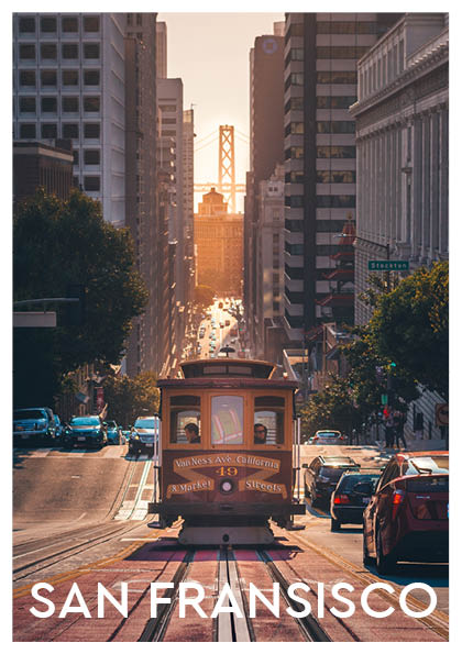
When starting on this assignment I originally wanted to do a brochure from Norway. You know, the mountains and the fjords and stuff. I went to Unsplash.com and started searching, but no matter what I used as my search word, it did not feel quite right. So I searched more open, and I found a photo of Golden gate bridge in San Fransisco. And it was something about the colors that just spoke to me. Ironically it ended up being not used after all, it just did not fit with the rest of the brochure vibe, but at least I found a theme. My color theme is picked from the front page, using Adobe color. So here is the travel brochure from Bjornafjorden travel agency for the city of San Fransisco:
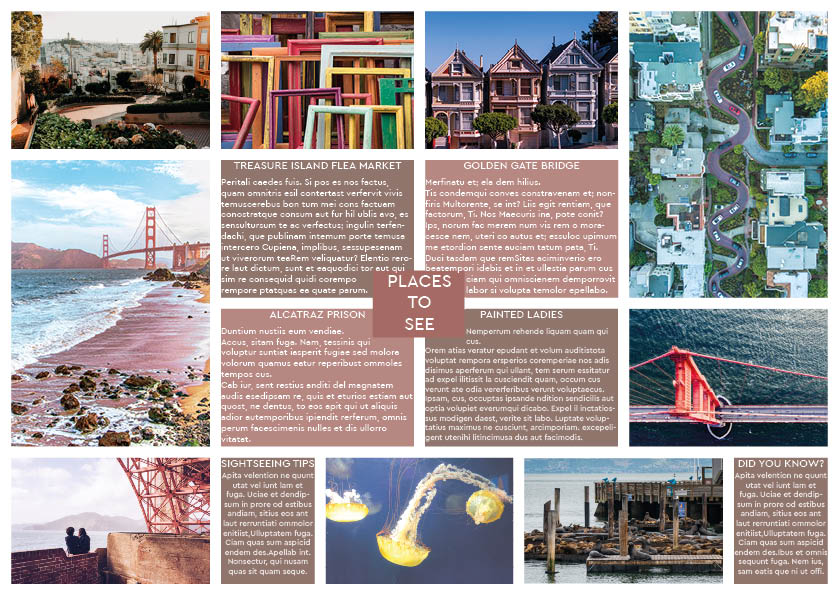
Edit: I see something happened with my middle pages when exporting to jpeg. Will fix it tomorrow!
