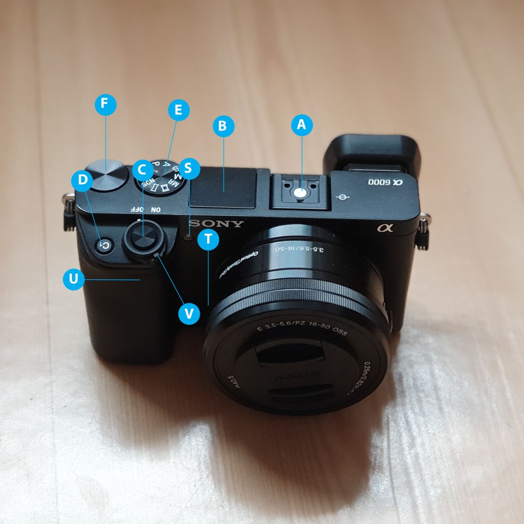
Get the basics right

Part one

The LA for this week kicks off with a couple of terms that I’m going to describe in my own words:

The Internet

The internet is an enormous global network of computers and other various devices that are connected to each other, with the main purpose of sharing information. For the computer or device to be able to connect to the information highway of the internet, it need to have a client installed which communicates with servers holding information. A client often is what we in daily language call an intenet browser, like Google Chrome. The device also need to have access to an internet service provider (ISP). When connectiong to the ISP, the device has it’s own Internet Protocol adress(IP), which basically serves almost as the adress for your home. The IP-adress can be kind of difficult to remeber, so we luckily have names we can remember instead. These names are mapped through Doman Name System servers (DNS) and make our navigation on the information highway much easier.

HTML

Hypertext Markup Language (HTML) is the computer language used for internet documents that are designed to be viewed in a web browser. In a non computer language, it could be described as the main recipe for a website. This recipe can tell us how the content we want on our webpage will appear. The HTML define how the content on our site will be sent, presented and retrieved. In our HTML documents, we can create structures, add paragraphs, images, and set up how these different things will appear, by writing in different styles for our different sections. To help out with this, we can embed Cascading Style Sheets (CSS) and JavaScript (JS) to make beautiful, simple( yet advanced), and user friendly websites.

Browser

Most of us know Mozilla Firefox, Internet Explorer, Google Chrome, Opera and Safari, these are popular browsers which are used to access the internet. A browser is an application on your preferred device, and is often known as a client. The browser (client) is communicating with web servers to find information we are looking for. The browser works as a translator to turn the HTML into the webpage we were in search of.

Search engine

A search engine is a service to help us gather wanted information easier. The search engine sends out whats commonly called spiders to crawl and search the internet for words and information from webpages. These spiders bring the information back to their host, which store it in a index (database). The information and search words are then ranked in a range from what the search engine believes (ore are paid) to be more to less relevant. One of the most known search engines today is Google.

The briefing process

For the next part of this weeks LA we were presented with 10 questions we would want to ask our clients in order to get a good brief. We were then told to please research and add another 10 questions to the briefing process. From this list of 20 questions please create the ultimate list of 10 questions that you would use for clients.

Here are the 10 questions we got presented with:
  1. What kind of visitors are you expecting on your website? (Consider their income, interests, gender and age.)
  2. Who are your competitors and how do you differ from them?
  3. What actions do you want visitors to take on the site?
  4. What is your deadline for completing the site? How big is the budget?
  5. What features should be used on your website? (This includes things like contact forms, pictures, videos, etc.)
  6. Please list the names of three sites that you like and explain what you like about them.
  7. Do you have any colour preferences? What should the look and feel for the website be?
  8. Who will be the contact person for this project?
  9. What do you NOT want on your site in terms of text, content, colour and graphic elements?
  10. Who will be responsible for maintaining the website? Will the person have the time and skills to do so?
Here are the additional 10 questions that I want to add:
  1. Do you have an existing website?
  2. Do you have a domain name? (If they do not have an existing site)
  3. Can you tell me about your company’s core values?
  4. How would you measure success for your website?
  5. Do you have a brand style guide for your company?
  6. Do you have any written text and images ready, or would you like me to provide it?
  7. Are your company active on social media? And if so, what is your preferred social media?
  8. What feeling would you like to visitors to get from your website?
  9. Do you need an online chat solution for your page?
  10. Do you want the website to be mobile friendly?

Part two

For our last assignment this week we were told to surf the web and find 10 sites you would consider to be great websites. Simultaneously, make a list of 10 sites you consider bad web sites. Remember to describe why you would define them as such. Here we go:

Great websites
  1. Finn – Nice and clean site . Good amount of white space. I like the wide range of search options that makes it very easy to get to the information I want.
  2. Netflix – Clean and easy to navigate, the colours of the site works well togheter with chosen photo background on the front page.
  3. Ikea – Good site with clean layout, and easy navigation.
  4. Youtube – Easy navigation and a clean look, even when displaying a lot of different videos on the front page. After adding the night mode, it has actually become more calm for me, as the black background balances all the colors of the videos.
  5. Jollyroom – Clean site, good use of white space and easy to get around on the site and find what you are looking for.
  6. H&M – The site is clean, is easy to get around and find what you are looking for, and has a modern feel to it.
  7. Apple – This site is a good representation of Apple, it is clean, crisp and stylish.
  8. Nav – A couple of years ago, I would not have Nav in this category. But a good cleanup, has made the site quite clean, with a good layout and easy navigation.
  9. Power – Even if it do have a lot going on, the colours used on this site together with the layout, gives a clean look.
  10. Meny – Clean site, easy to navigate, good use of colours associated with the company, and crisp, clean photos.
Bad websites
  1. VG.no – There is just so much happening here. Even if I can see the layout very clear, all the different colours, themes and sections, spiced with a bunch of commercials, just clutters it up and makes it messy.
  2. Ebay – Although they have a good navigation menu, there is a lot going on, and I find the front page actually quite difficult to look at.
  3. Pennyjuice – A lot of colours displayed, not in a modern coloursplash way. Seems very outdated and feels cluttered and messy without a lot displayed.
  4. Arngren – This page looks like an old catalog for mail order just threw up on the site. No clear layout, very cluttered and compressed site.
  5. Adlibris – It is not all bad, it just has a lot going on, and when you look at the site combined, it is cluttered up by all the different sections, that probably were meant to keep it clean.
  6. Naboen – We came across this site during an mandatory assignment. This site is just really outdated, and not in sync with the image of being a cozy place that the restaurant want to get out to potential customers. (The first time I visited the site, I did not first understand that the photo was a button to continue into the site.)
  7. James Bond 007 Museum – This site has no apparent layout, has photos and text in all kinds of sizes. It was just bad.
  8. Wikipedia – The site has a lot going on, and feels cluttered and outdated colourwise.
  9. Gatesnfences – This must be one of the very worst I have ever seen. The range of colours, different buttons, text and layout, all mashed together makes it a soup of messiness.
  10. Amazon – Has a lot going on, there is just a whole lot to take in when you visit the site, and it feels very cluttered and almost stressful.

Designing a travel brochure

The last assignment this week was to use InDesign to design a 4-page brochure for a fictitious travel agent.

  • The size of the brochure should be A5 (when it is folded).
  • Design the brochure in full color.
  • Use fake body copy, but create sensible headings.
  • Use titles, headings and images of your choice.

When starting on this assignment I originally wanted to do a brochure from Norway. You know, the mountains and the fjords and stuff. I went to Unsplash.com and started searching, but no matter what I used as my search word, it did not feel quite right. So I searched more open, and I found a photo of Golden gate bridge in San Fransisco. And it was something about the colors that just spoke to me. Ironically it ended up being not used after all, it just did not fit with the rest of the brochure vibe, but at least I found a theme. My color theme is picked from the front page, using Adobe color. So here is the travel brochure from Bjornafjorden travel agency for the city of San Fransisco:

Edit: I see something happened with my middle pages when exporting to jpeg. Will fix it tomorrow!

Pace and contrast

«Compare the design (in terms of pace and contrast) of an online magazine, blog or website to that of a printed magazine, book or journal. What differences can you see between the kinds of design strategies used in the two formats?»

I’m comparing a printed version of KK versus the KK.no. The printed magazine seems to be using a range from two-column to four-column grids. The online magazine uses two-column and three-column grids on their front page, and one-column grids inside the articles. If you look past all the advertisement(which is a lot!) in the online magazine, the design is cleaner and less decorated then the printed magazine which has small notes of texts and drawings on photos and in between columns.

In the printed magazine the pages are varied, with different set ups on photos, texts, use of color and grids. The online magazine had their one-column grid, only broken up by photos (and advertisement.) Speaking of advertisement, the printed magazine also has a lot of them, but here they have their own pages, not blending in and messing up the articles.

Basic principles of layout

«Take a magazine, newspaper or book that includes images and text. Lay tracing paper over the top of three spreads (both left-hand and right-hand pages). Using a pencil and ruler, carefully trace the grid underlying the page layouts. Remember to remove specific text elements or images, and to only draw the grid lines. Note column widths and margin sizes at the top, bottom, and to the left and right of the main body of text. Is your document based on a two-column, three-column, or another type of grid? Which elements stay the same on each page, and which change?»

I chose to use an old magazine that I found at home, called Rom 1-2-3 from 2017. Here are my chosen pages and drawings:

The interesting about this magazine and the pages chosen was that there is a whole bunch of different looks and sizes. Regarding the grid, the document seems to be based on a two-column grid. The column widths varied from 5 to 9,3 cm (Measured: 5 cm, 8,5 cm, 9,2 cm and 9,3 cm). Some of the pages used two different column widths in one page, and others had the same width. Margin sizes was also very variable, but the pages measured all had a margin size 1,7 cm in the bottom, and on the top I found two different sizes 1,7 cm and 2 cm. On the left side I noted down 1,5 cm, 1,9 cm and 4 cm, depending on type of page. The right had variations of 1,4 cm, 1,9 cm, 2 cm and 3,4 cm. In the middle of the columns, I measured 0,7 cm, 1,6 cm and 1,7 cm.

The pages are very picture based, and seems playful around their layout. A lot of the left pages had big photos on them, many had a photo on the whole page, and a bit of text on top of the photo. The right pages often had a bit more text, but were also very heavy photo wise.

Symmetry/asymmetry

«In this assignment, you will be given the opportunity to also test your idea sketching skills. It is important to start working with basic ideas on paper and develop your concept from there on out.

  • On an A4 landscape page, draw four equal squares. Create 4 more pages in this way. So, you’ll have 5 pages with four squares on each.
  • Draw one or two squares or rectangles in each empty square to achieve the following visual effects. You can work with the interaction of rectangles and squares to make the balance or imbalance more evident.
  • Entering left
  • Movement to the right
  • Movement to the left
  • Movement downwards
  • Movement upwards
  • Balance
  • Tension
  • Symmetry/asymmetry

Produce at least two different versions of each effect, recording your results each time. Explain in one or two sentences what you wanted to achieve.»

For this assignment I chose to work with squares and rectangles separate, here are my attempts:

Entering left and Movement to the right

Entering left: Here I tried to make it look like my squares and rectangles is on their way into the paper. The last one is just halfway there.

Movement to the right: I tried to make it look like my squares and rectangles is sliding towards the right edge, by placing them near the right side of the paper.

Movement to the left and Movement downwards

Movement to the left: On this effect I tried to make it look like my squares and rectangles is making their way towards the left edge, by placing them near the left side of the paper.

Movement downwards: I tried to make it look like my squares and rectangles is almost falling towards the lower edge, by placing them near the bottom.

Movement upwards and balance

Movement upwards: Here I tried to make it look like my squares and rectangles is working their way up on the paper, by placing them near the upper edge.

Balance: In this I wanted to create balance. The square one is a single square in the middle of the frame. On the rectangle one, I used two rectangles placed in the middle, mirroring each other.

Symmetry and Tension

Symmetry: In this one I placed the squares and rectangles like the eyes on a dice and as an equals sign, to create symmetry and balance.

Tension: Here I placed my squares and rectangles at the edges of the paper, opposite of each other. Trying to make a conflict on where to rest the eye, and create tension.

Asymmetry

Asymmetry: Here I played around with the squares and rectangles, making different kinds of combinations. Without making them messy and unpleasing to look at.

Form and space

Rearrange shapes cut out of paper, and try to find the point at which the figure disappears into the ground.

For this assignment I cut out a bunch of different shapes of paper, I went a bit overboard, and did not even use half of them. I played around with them and after a while my conclusion to this assignment is: If the amount of black and white paper is about the same, or have some sort of pattern/symmetry in them, the figure/ground become more unclear.

Exposure basics – Taking pictures

The last assignment this week told us to: Take five pictures every day for the next five days. The subjects of your pictures can include a series of different objects, people and landscapes. Apply the manual settings as explained in your textbook. Submit your six best pictures at the end of the week, listing the following with each picture:

  • ISO
  • Aperture
  • Shutter speed

I had a lot of fun, and took a lot of silly, useless and weird photos this week. Here are my six photos:

ISO 100 f/3,5 1,6
ISO 200 f/5,6 1/640
ISO 100 f/36 1/6
ISO 200 f/5,6 1/2000
ISO 12800 f/8 1/4000
ISO 200 f/3,5 1/100

Exposure basics – getting familiar with my camera – twice

Sony a33

Our first assignment this week was to get to know our camera, and here is my sturdy old Sony a33 camera. It has not been used nearly as much as it should, but now was the time to get going. We had a blast the first couple of days, we went through the first two chapters of the Snapshot book, and started practicing. And then it died, in the middle of an update. Dead battery you say? Nope! It will have to take a trip to the camera doctor, and I were stuck with no camera. The solution? Buying a new camera. So yes, here is my new friend Sony a6000, this way I can still use my book, and could still do this weeks assignments in time.

The first thing was to name all the functions and buttons on the back and front of my camera:

How would you set the correct ISO?

By either pressing to the right on the control wheel(P) or via the function button(N.)

How would you change the aperture?

The easiest way is by turning the rear dial(F) on the camera.

How would you change the shutter speed?

By turning the control wheel(P.)

A little dive into the history of photography

Assignment 1

Our first assignment this week tells us to: «Pick three events in the timeline from this week’s lesson History of Photography: An Introduction, and find photographs of the event on the Internet or in the library and write a paragraph explaining the event in more detail. Include your photographs in the description.» In the lesson we have learned about several interesting events, and it were difficult to make a choice, I have decided to go with these:

The Camera Obscura

Picture from Wikipedia

The natural optical phenomenon called Camera Obscura, is when an image of a scene, gets projected through a small pinhole in a screen or wall, and appear completely reversed and inverted on a surface opposite from the tiny hole. Around 330 BC, the greek philosopher Aristotle used a rough version of the pinhole camera during a partial solar eclipse, but the first one to theorize about this concept, was Mo-Ti, a chinese philosopher in 400 BC. The pinhole camera effect was thoroughly studied by the Arab physicist Ibn al-Haytham in the 11th century. His work on this effect, even if he was not the one to discover it, became highly influental all over Europe. Leonardo Da Vinci was also involved with this effect, and he defined the Camera Obscura as a device designed to reproduce linear perspective.

Ps. Did you know Camera Obscura is latin for dark room?

The invention of Daguerrotype

Picture from Wikipedia

Daguerreotype is the name of a photographic process, named after Louis Jaques Mandé Daguerre, the french artist who invented the technique. He worked together with Joseph Nicéphore Niépce to develop a method to permanently capture the images given by a camera obscura. Unfortunately Niépce passed away, but Daguerre kept experimenting, and succeeded, announcing his work to the public in january 1839. He found a way using silver-plated sheets of copper, along with several different chemicals. In august 1839, the details on this new process were presented to the public as a gift to the world from France.

The Ambrotype

Picture from Wikipedia

Once upon a time Sir John Herschel made an observation that if under exposed negatives are put in front of a black background, it will appear positive. This inspired the invention of the ambrotype.

In 1850 the english sculptor Frederich Archer invented a new way to process the development of pictures. The result of this wet-plate collodion process is known as ambrotype. To make a ambrotype, you treat a glass plate with a clear syrup-like liquid, and then immersing the plate in a silver-nitrate bath. The glass plate was then put inside the camera and exposed to sunlight. When the positive image is finished, the dark background will make the highlights, shadows and details in the photo appear.

Assignment 2

For our second assignment, we were asked to choose one technique from this weeks lessons, do additional research and write a report on why this technique have contributed to what we can do today with photography.

The invention of film roll, made by George Eastman
Picture from Wikipedia

When I was I child my very first camera was a Kodak camera, after a couple of disposable cameras, I saved up my birthday money, and bought myself a camera. And although it was nothing like the cameras today, oh boy! It was simply magic! Standing there at the store, being handed the envelope with your own photos, and then flipping through them to see how many thumbs, unclear shots and closed eyes you actually had managed to catch this time. I think we all grew up hearing about a Kodak moment, even though we did not speak english at that time, it was for everyone, simply everyday magic. And this fast and easy development process was possible, thanks to one little thing: The film roll, invented by George Eastman (1854-1932.)

Picture from Wikipedia

The first Kodak camera was introduced in 1888. The camera was just a box, preloaded with a film roll for 100 pictures. When the roll were full of memories and photos, the customer could send it back to the factory. In return, they got a new roll of film in their camera, and developed pictures. It became much easier for more people to gain access to a camera, without being professional photographs or wealthy. The process of taking pictures, replacing the film and developing them, was so fast and easy, that the Eastman Kodak company had their own slogan about it: “You press the button we do the rest”.

Picture from Wikipedia

In 1889 he introduced a transparent based film roll, that since have remained as the standard for film rolls.

Bringing the ability to take photos and capturing images of memories to more and more people, and people seemed to love it. They took pictures documenting all the memorable situations and occations. Could you imagine getting married or greeting your first born grandchild without the possibility to take photos?

Giving the opportunity of owning an camera to more people, is in my eyes the start for the diversity in photography we have today. If only trained photographers or very wealthy people would have access to it, we would not be blessed with all the input and possibilities we can find today.

Even if we now mostly have moved on from analogue cameras to digital cameras and cell phones, I think we would not be where we are today if the film roll had not expanded the availability and time it took developing, for everyone.

Today photography is often reviewed as fine art, and it is really difficult to imagine a world without the possibility to take snapshots of everything you love and want to remember.

Speaking of opportunities of having a camera, the studies this week has made me think about my old cameras, I probably have to go for a treasure hunt in the attic sometime in the future. If I am lucky my old cameras still work. And in the meantime, I can wait in excitement for the development of the first disposable camera used by my five year old. Just a couple of days, and we can again count thumbs, unclear shots and closed eyes. And possibly having sparked the joy of photography, I may also have to buy a roll of film in the near future.