Our last assignment this week was to design a book cover for one of these books:
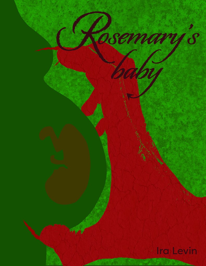
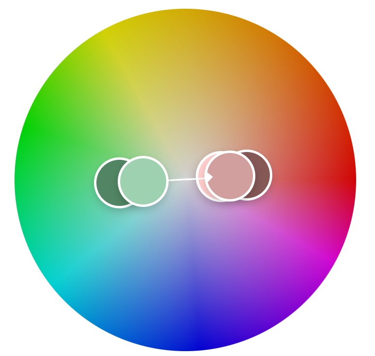
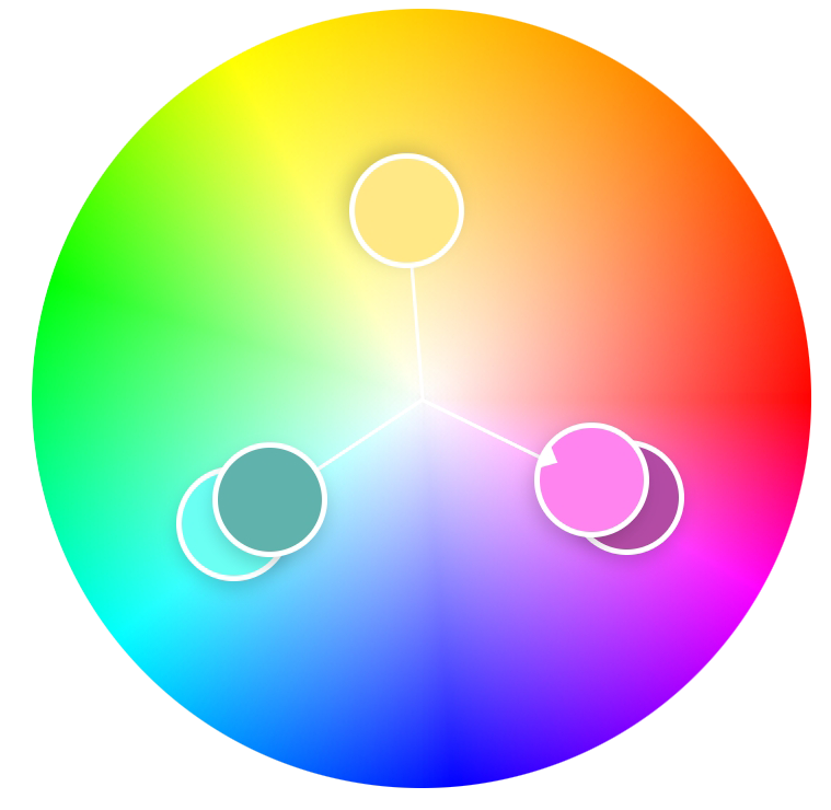
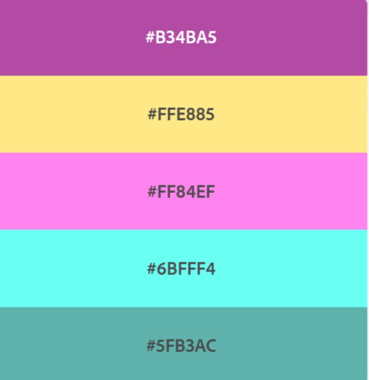
“Rosemary’s Baby” by Ira Levin: use complementary colours to express anguish and uncertainty.
“Animal Farm” by George Orwell: use analogous colours with a contrasting accent to express disagreement and discontent.
“The Secret Garden” by Frances Hodgson Burnett: use secondary colours to express naivety, honesty and harmony.
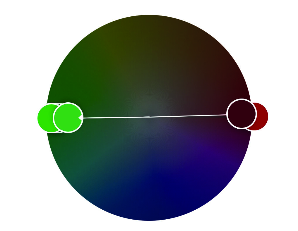
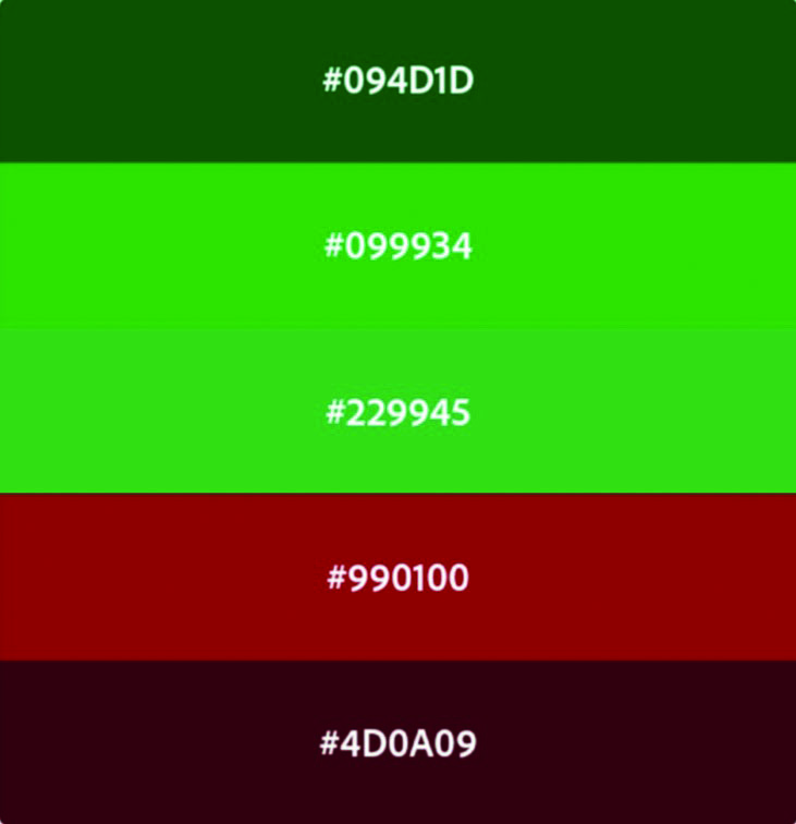
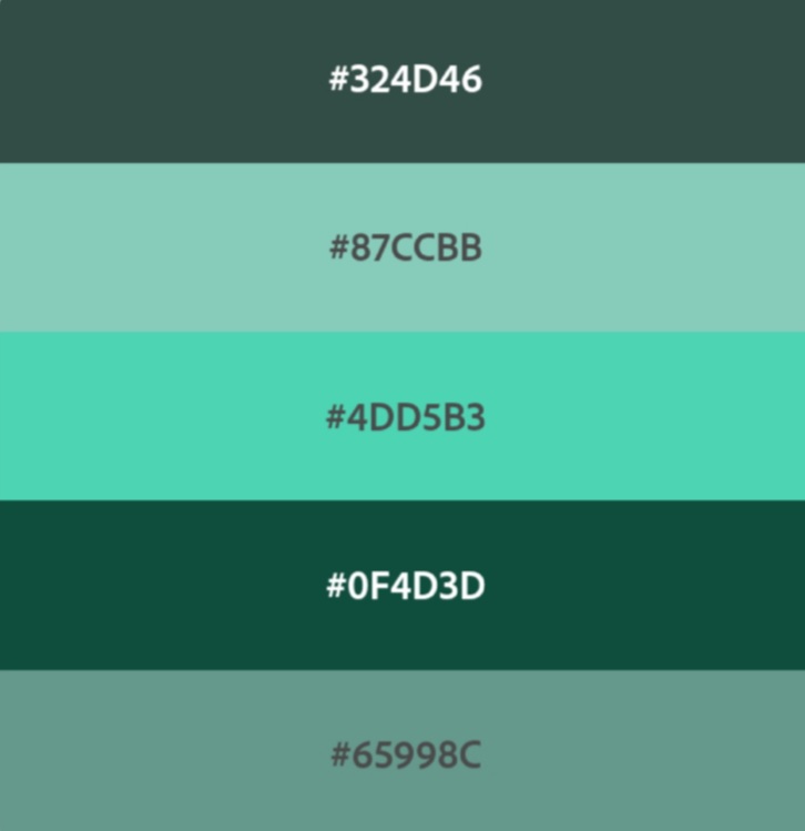
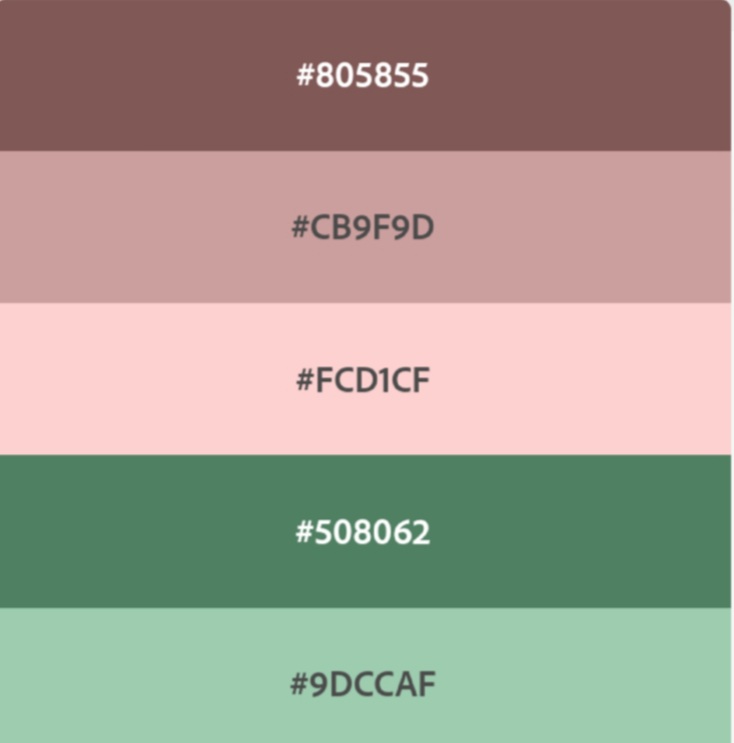
I chose to do «Rosemary’s Baby.» Red and green are the perfect complimentary color set for this one. Here are my color theme:
I had actually heard of the movie, but have never seen it before, so I had to start this assignment with researching the book, and figure out what it was about. I went for a creepy but not splatter kinda theme. I have played around in Photoshop and Illustrator for this assignment. I did not use all the colors in my theme. Two of them were pretty similar in the end, so I used only one of them. I have also tested out some patterns, and different levels of opacity to get effects without using a whole bunch of colors. After drawing this, I think I have to read the book. I guess it could do as some good summer reading? Anyway, here is my attempt at a book cover for «Rosemary’s baby,» enjoy:
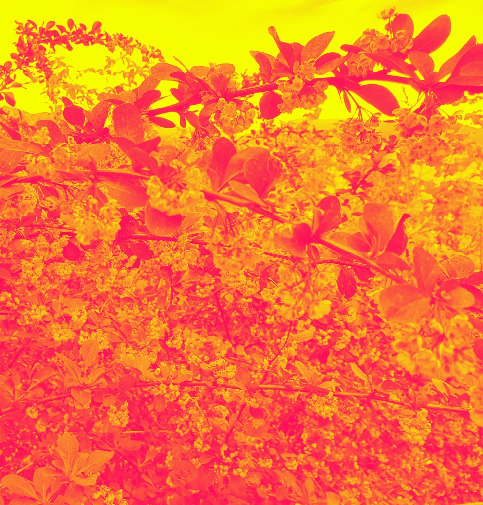
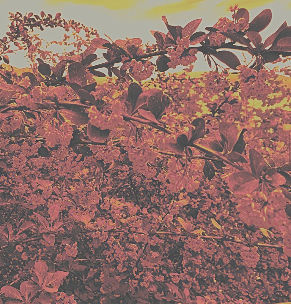
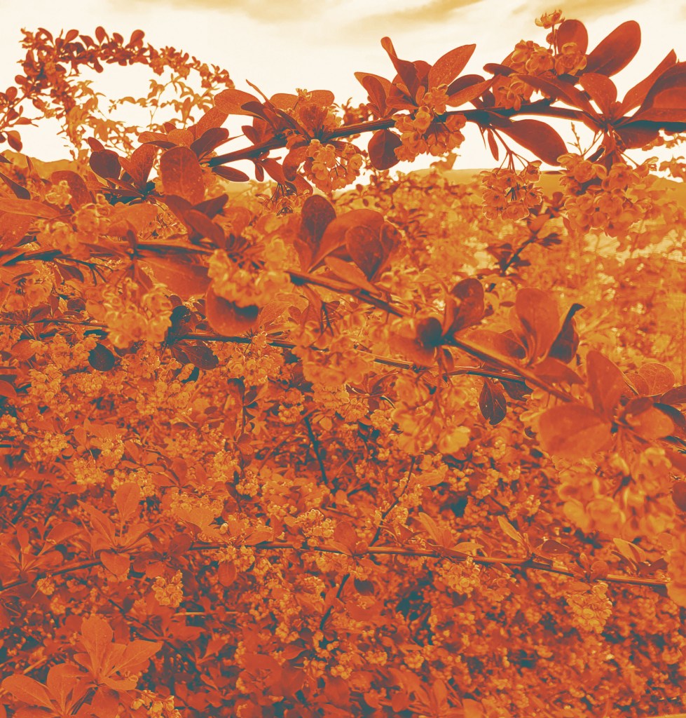
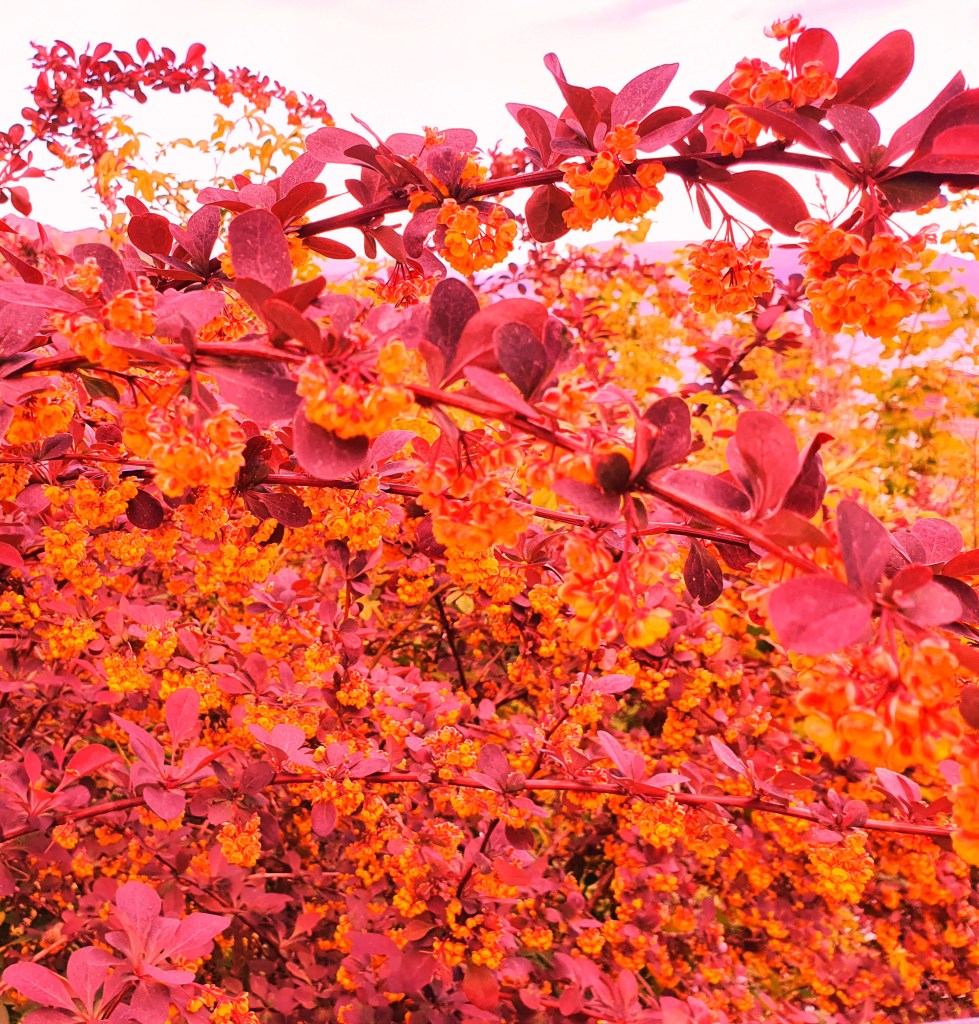
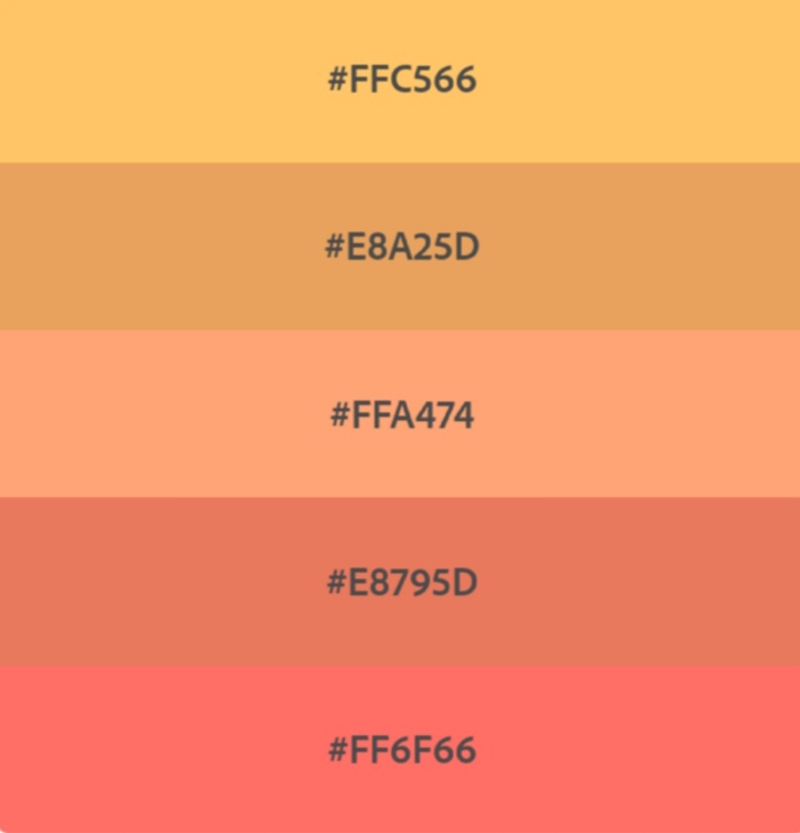
For this learning assignment I get to take a color of my choice and create four different color effects. The four effects are:
Create a fluorescent duotone
Apply a monochrome look
Split toning of the image
Freestyle: Create a color effect of my own choice
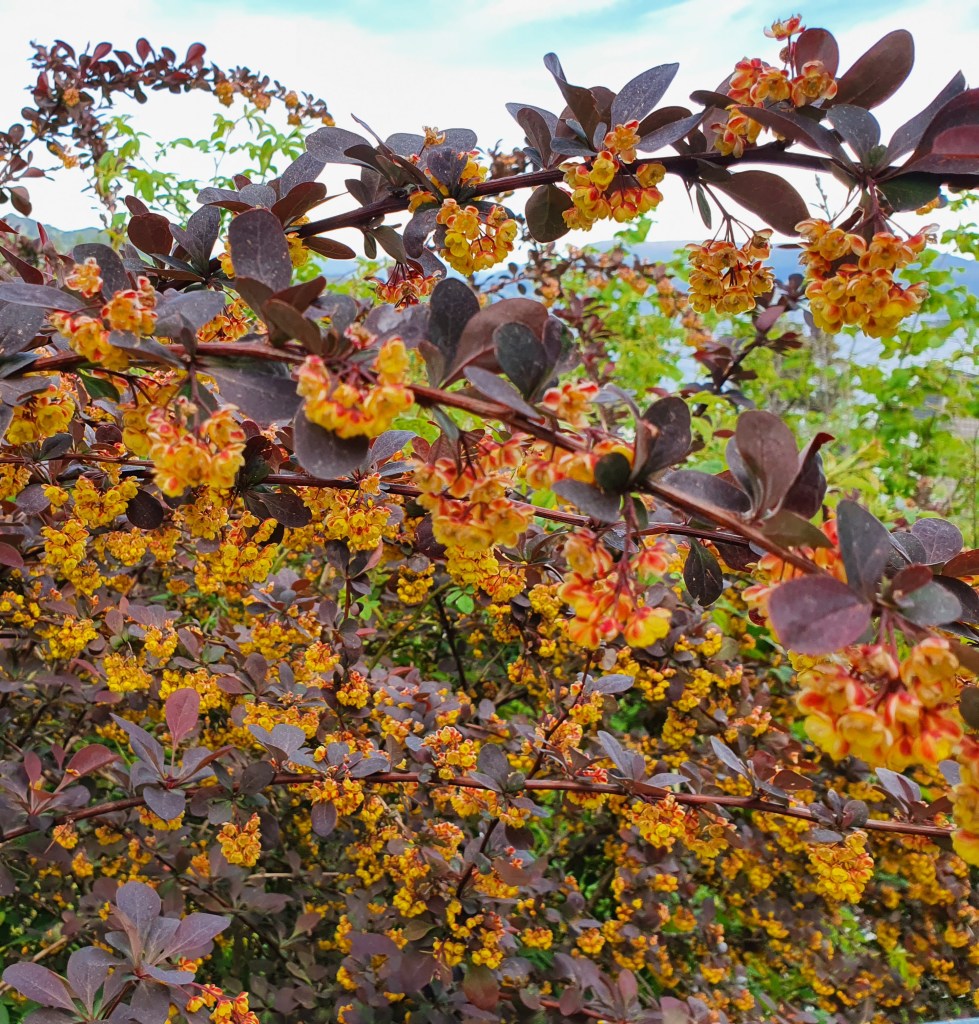
The photo I used, is one I shot in my garden. I think the original also had some fun colors and contrasts, and I wanted to see what else I could do with it.
Well, I had so much fun doing this, and ended up with a total of 12 different ones. Yes, way too many to present in this assignment. I made two with fluorescent duotone, three with monochrome look, two with split tones, and the rest: a whole bunch of different freestyles. Since the assignment says to present four, here are my favorites:
Fluorescent duotone
Monochrome
Split tone
Freestyle
Freestyle 2
I know I said four. I just had to add this one as well, I think it is too cool to not show. Sorry, not sorry.
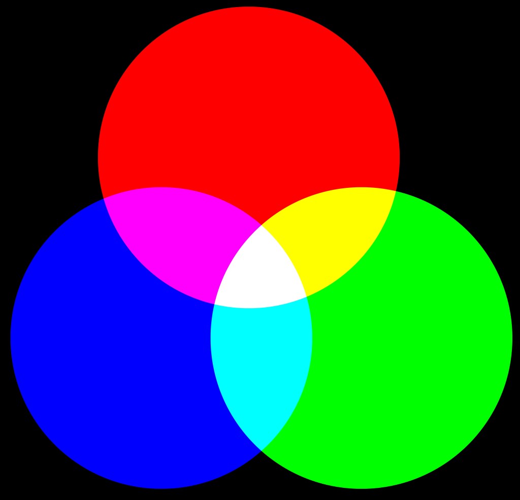
This weeks learning assignments are all about colors. In the first one we are to explore in Adobe Color, and develop four different color schemes. We also should describe the what these two color systems means: RGB and CMYK, I will start with this:
RGB
In the RGB color system, we have red, green and blue as the primary color. In the RGB system we find millions of colors. The RGB color system is for digital images, has a range of brightness which we measure in levels from 0 – 255, and is also known as the additive system. By this we mean as we keep adding or mixing color, we add light. And as a result of this, if we mix enough, we start with black(no light and 0 brightness) and will end up with white(light and 255 brightness.)
CMYK
In the CMYK color system we find the primary colors cyan, magenta and yellow. These three should if mixed enough should in theory end up as black color. But the theory is not always correct, if we keep adding color, we will get a murky, dark brown, and just a mess when it comes to colors. To help with this, we have the K, which stands for Key(Black,) and is used since the CMYK color system is for print and ink. In the CMYK system, we find thousands of different colors. The CMYK color system is known as the subtractive system, this means as we keep adding or mixing color, we add ink, but subtract the light. This system works on percentage levels, meaning we start out with 0% (white paper) and could end up with 100% (black color)
Adobe color
Here are my takes on the four following color schemes:
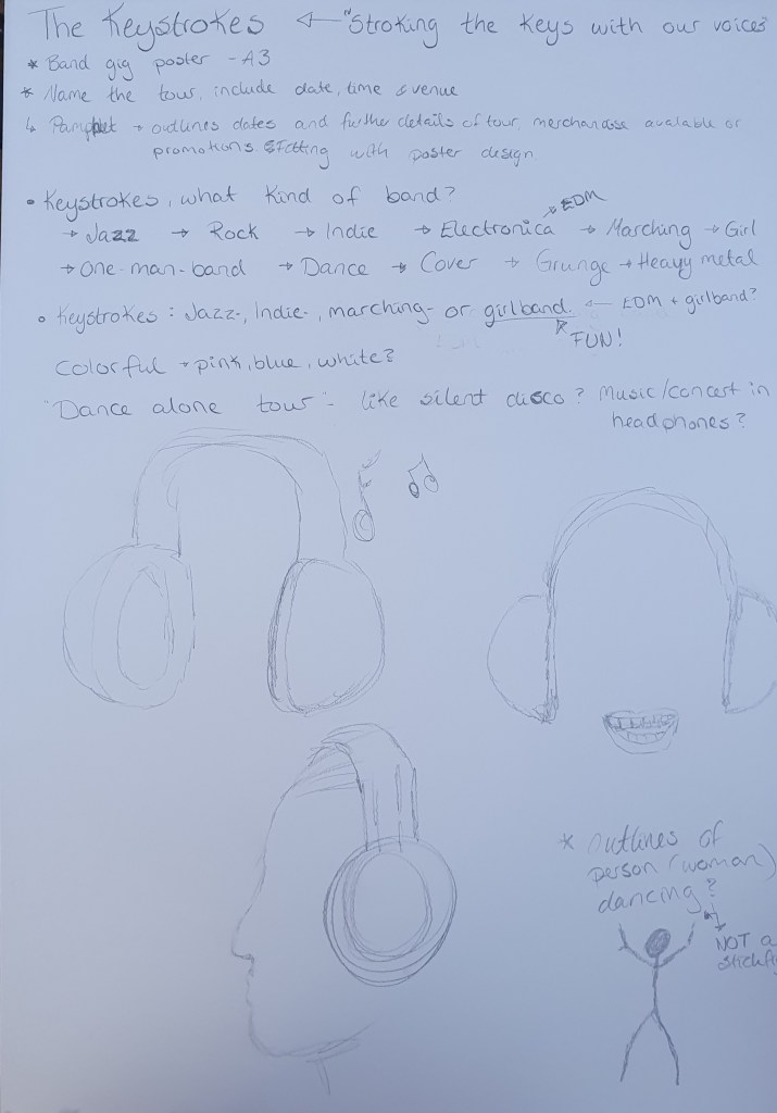
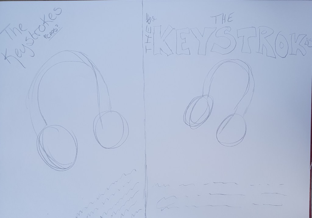
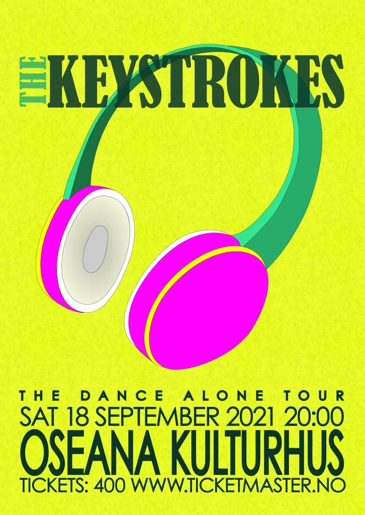
The third and last learning assignment this week was to design a poster in A3 format, for a band’s gig. The band is called The Keystrokes. We were to choose the name of their tour, dates, time and venue.
I used quite a while playing around with what kind of band The Keystrokes are, should they be a grunge band? Or a marching band? (You can call this inspiration the month of May in Norway.) The Keystrokes could even be a one-man band. Fun, fun, fun! I ended up more in the electronic dance music (EDM) genre, I visualized an hybrid between a girl band and EDM, I almost have a slogan for them as well: «Stroking the keys with our voices.» For their tour I came up with «Dance alone tour.» Hello social distancing in 2020/2021. The concept for the tour is concert meets silent disco, everyone hear the music in headphones, instead of in plenary. I then settled on wanting to do my illustration with either headphones and/or someone dancing.
I chose tp do my poster for a very local gig, placed in my hometown. As you can see from the other places on the tour list, this is a very important and big town. Just kidding, I just wanted to promote my hometown a bit. My gig poster attempt ended up like this:
I knew when I started, that this had to be in a lot and bold colors. For the illustration, I traced a photo of my headphones, and simplified it. To create a bit of texture I used two different patterns, and turned the opacity real low.
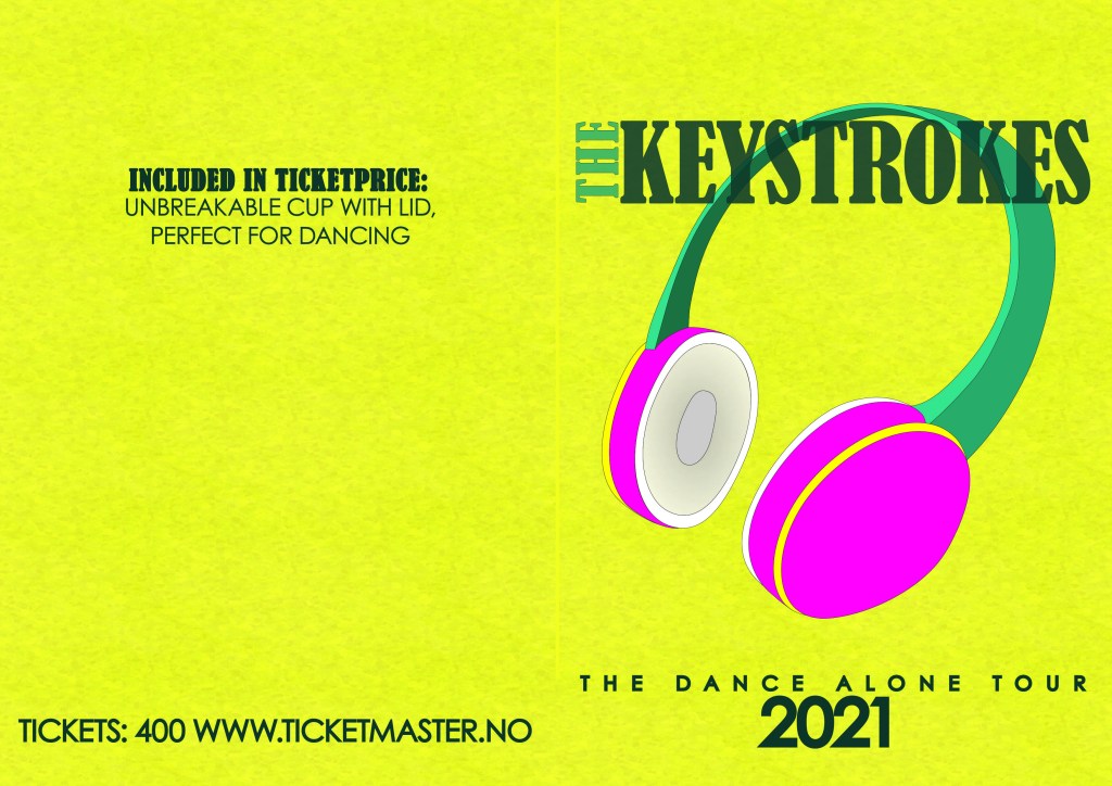
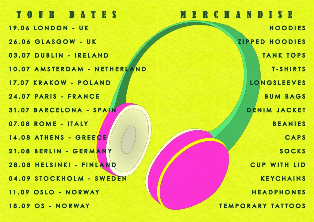
We were also told to expand our design to include a pamphlet, with dates of the tour and information about merchandise etc. I chose to make mine a folded one, so I have made Front and back on one illustration, and have made the inside in another illustration.
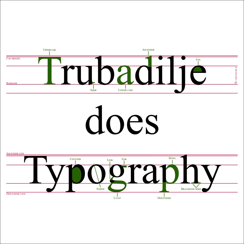
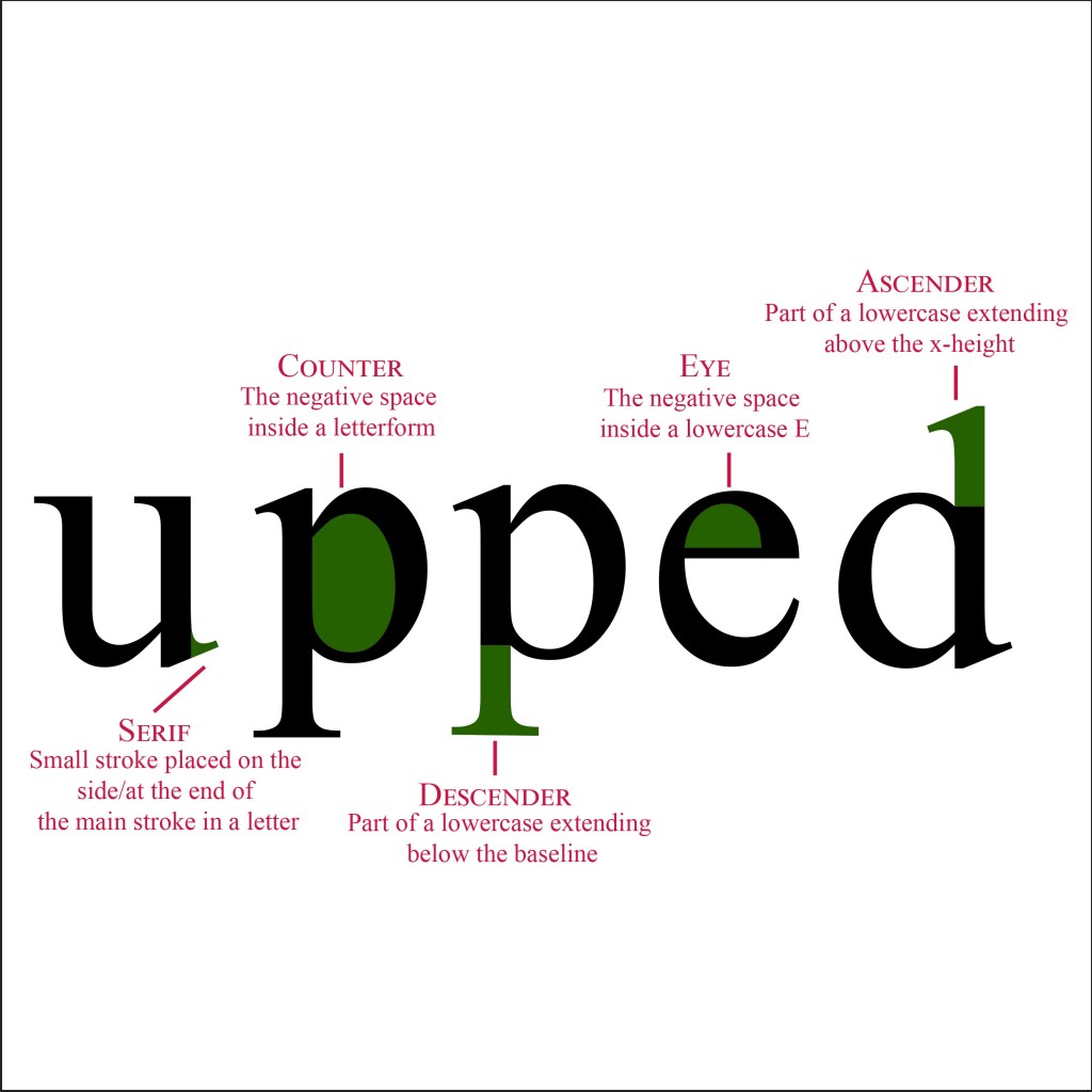
Our second learning assignment this week told us to explain the anatomy of type in a visual way. We could either use one typeface, or up to three different ones. The colors was limited to using only three different ones, but we could choose the three ourselves. I chose to use Times new roman for this assignment, this is a well known typeface, and it used to be my favorite one when I was younger. Here is my take on the visualization:
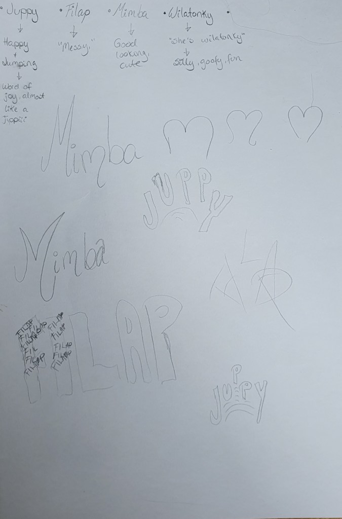
The first part of our learning assignments this week was to create a new word. This was to much fun, in our house we make up words all the time. As an example, when my oldest was three years old, her favorite rude word was to call people «Skinke patruljebåt.» That translates into calling people a Ham patrol boat. We also have a word replacing attention or oppmerksomhet in norwegian, asmest. So you see, the bar is high when assigned to creating new words. I actually wrote down four, and played a bit around with them:
Juppy – A combination of jump and happy, a word of joy, almost like jippi(norwegian) or yay.
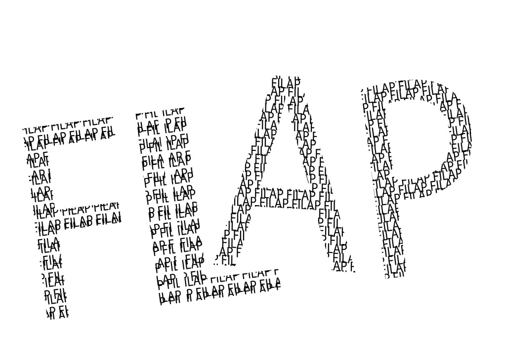
Filap – A word for messy.
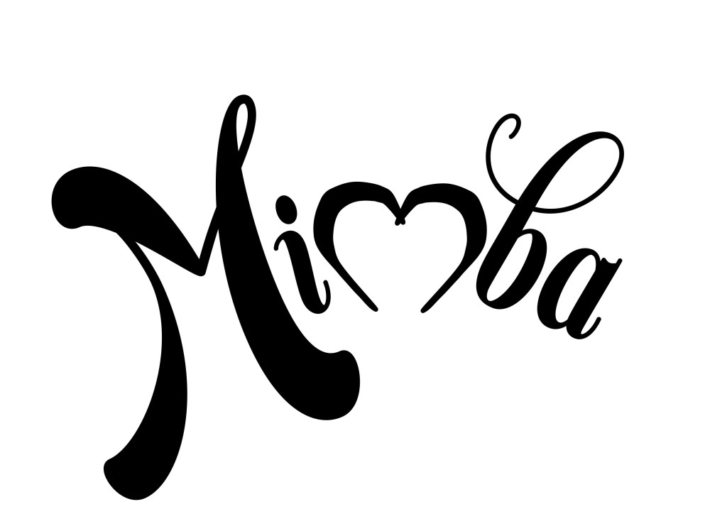
Mimba – A word for a good looking person. (Could also replace a combination of sexy and cute.)
Wilatonky – «She’s wilatonky!» A word for silly, goofy or fun.
After sketching and thinking on the different ideas, I chose Mimba from my new words.
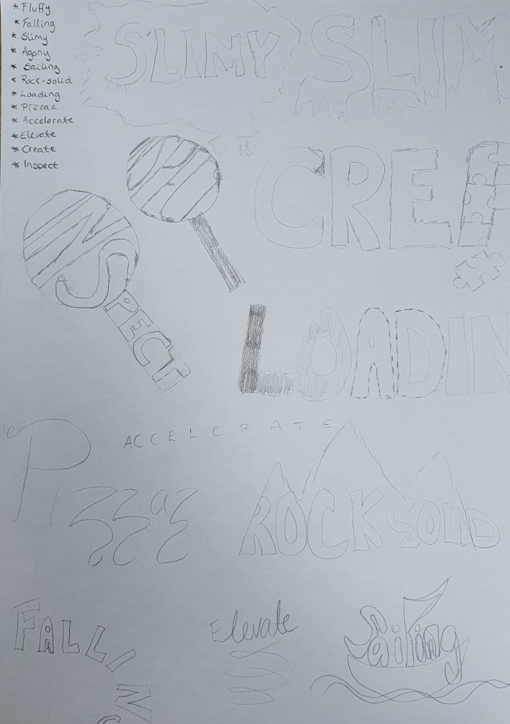
The next part was to choose two extra words from the following words:
Fluffy
Falling
Slimy
Agony
Sailing
Rock-Solid
Loading
Pizzaz
Accelerate
Elevate
Create
Inspect
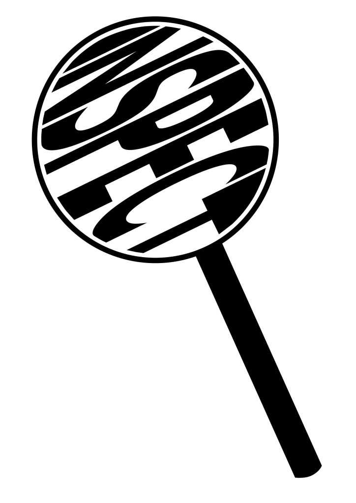
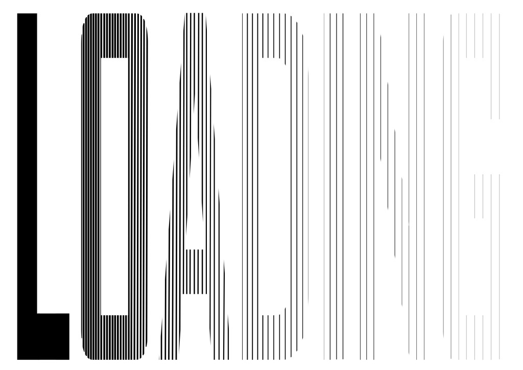
I found it kind of difficult to choose, so I tinkered on several of them. I tried out different ideas, and ended up choosing Inspect and Loading.
The last part of our first learning assignment this week was: «Create three different compositions, showcasing your three words, one word per composition. In each composition, arrange each individual word to express its meaning, using only the colours black and white. Consider all and any means at your disposal: dramatic scale contrasts, cutting, repetition, letter spacing, etc.Each composition should fit onto an A4 format. You can play with the size, spacing, placement and orientation of letters while being cognisant of how the word(s) interact with the entire format.Consider the entire format as an important design element: use all available space; don’t simply centre the word – think of this as an opportunity engage the viewer throughout the entire layout. Experiment. Play. Push to the edges of the page. Repeat elements if it helps to get the meaning across. Choose a very simple creative solution, if you find this direction more appropriate.Make sure to only use one typeface for each composition, noting the suitability of the choice of typeface to the individual word; you can experiment with various styles (light, bold, condensed, uppercase, lowercase). You may repeat, omit, slice, block or overlap words or letters.However, please do not use drop shadows or similar computer-generated effects.»
After sketching and drawing in Illustrator, I also wanted to draw up Filap.
Inspect
For this illustration I ended up with the design of looking at the word through a magnifying glass. The illustration of inspecting the word Inspect.
Loading
My loading illustration is made up with lines, except from the solid L. The lines gets thinner and thinner, and the spacing between the lines wider and wider. Making the word filling up, and load from right to left.
Mimba
For the illustration for Mimba, I wanted curves and flowing feminine lines. The m in the middle is made different from the other ones. I made the m based on the shape of a heart. But if you flip it upside down, you get a body part, which I will leave unnamed.
Filap
For the Filap illustration, I wanted to make a clean mess, if that makes sense. I made the letters with two sets of the word written all over, and tilted one of them, to create some messiness. I have arranged my letters with uneven spaces between them, and tilted some of them in different directions.
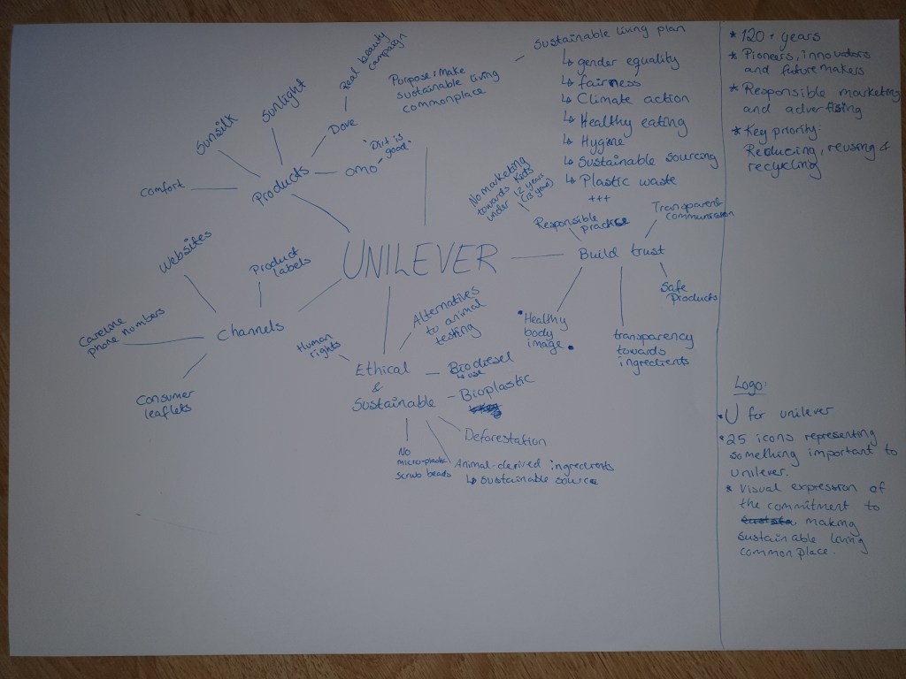
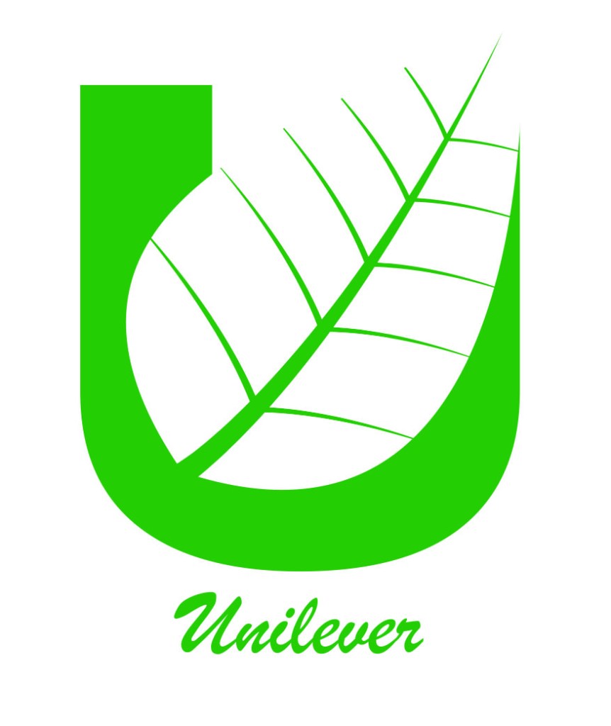
The third and last learning activity these weeks is about the Unilever logo, and the Gestalt Principles we worked on in Ma01 – Design Principles.
Assignment 1: Look at the following logo and consider the shape, form, simplicity of design and the way it communicates.
The Unilever logo is a brilliant way to express all the things Unilever as a company stand for. The U-shaped logo, is built up by 25 different icon, where each one has a meaning for Unilever as a company. All the icons have been simplified, some almost into an abstract version, others are easier to recognize. This without making the logo messy and distracting to the eye. After researching and reading up on what Unilever as a company stand for and want to do, I think that choosing the color blue as their logo color is great. Unilever seems like a company that wants to do good, and help the earth and the people on it. The blue color make the logo come across as calm and trustworthy. It also helps tidy up and neutralize the effect of all the different elements of the logo, making it easier for the eye to see it as a symmetrical whole.
Assignment 2: In your own words explain what you consider the different Gestalt principles in this logo to be. Describe the logo and justify your answers.
For me the Unilever logo is mainly built up by the Gestalt principle proximity. All the icons making up the logo, are placed tightly together, helping us see this logo as a whole. I also think prägnanz had a little play in it, making up the simple shape of a U, with the simplified icons.
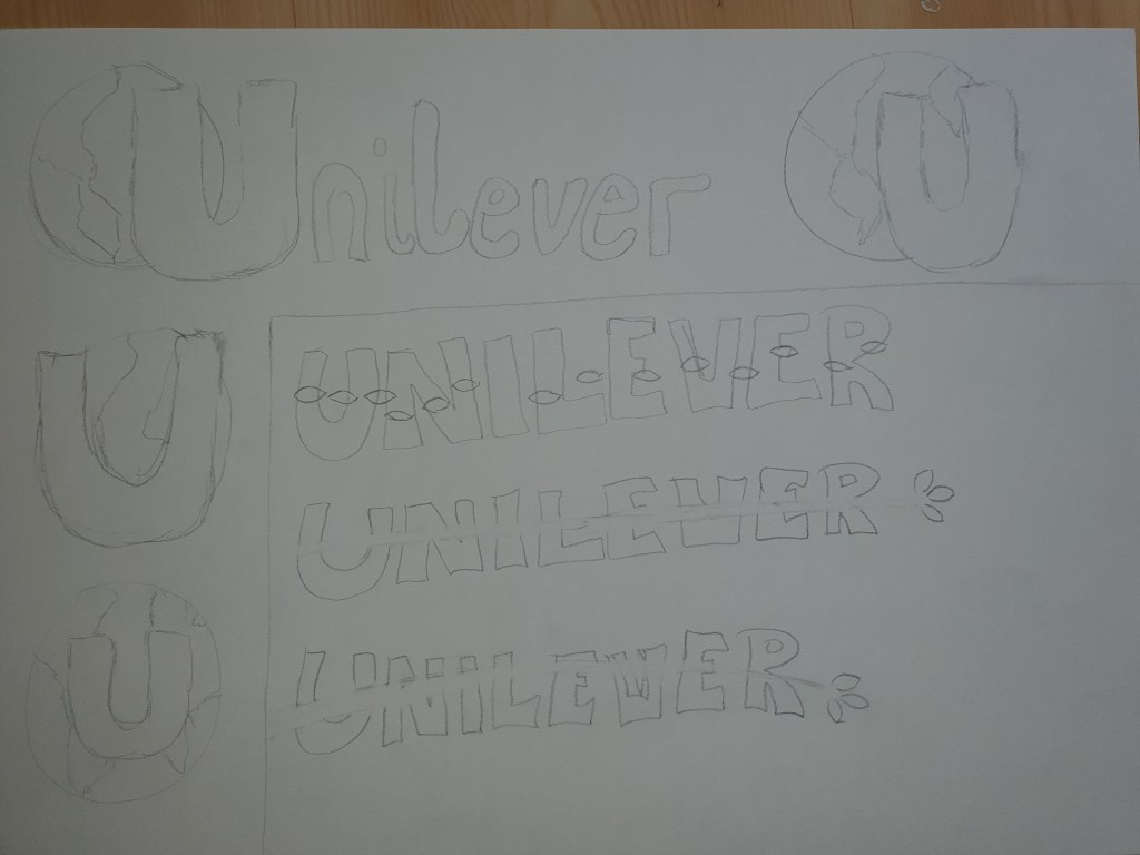
Assignment 3: Pick any 3 Gestalt principles and recreate 3 versions of the logo according to your chosen principle. Be creative and innovative with how you do it. Sketch, plan, and do it by hand before digitally creating your favorite option in a vector format.
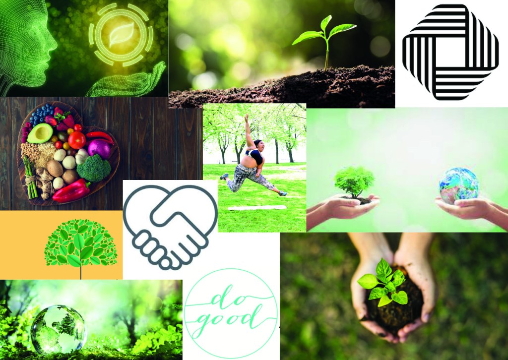
At first I was unsure what direction to take, and started out researching Unilever as a company, finding out more about them, making a mind map over their values and what they do. Gaining insight before researching inspiration in a mood board. As Unilever states: «Our purpose is to make sustainable living commonplace.»
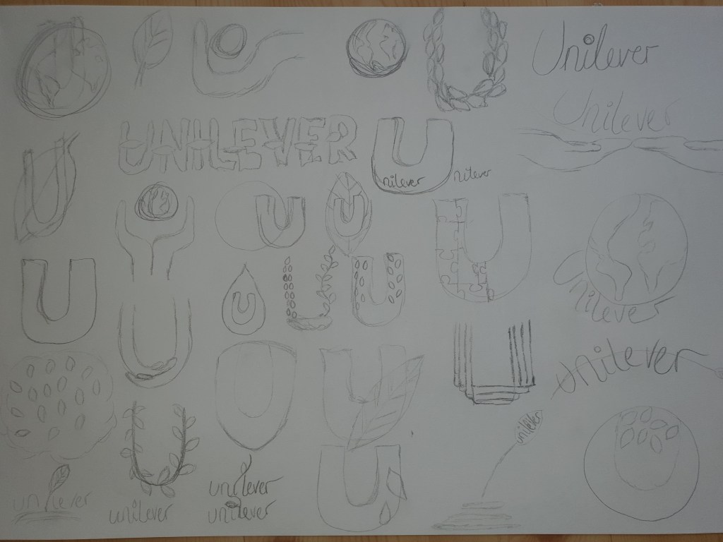
Finally I were ready to start sketching, I doodled and tossed out different ideas. All I knew, was that I wanted to keep the U in some way.
I chose three of my ideas that spoke a bit extra to me, and tinkered a bit more on them, before I made my choice.
I ended up choosing the following Gestalt principles: Closure, Continuation and Figure/Ground. The designs of my logos are maybe not the most innovative this time, but makes a good practice for assignments to come. When loading my designs up to the blog, my colors, that in Illustrator seemed a bit bland and boring, suddenly was a lot brighter on the blog. I actually like them much better here on the blog.
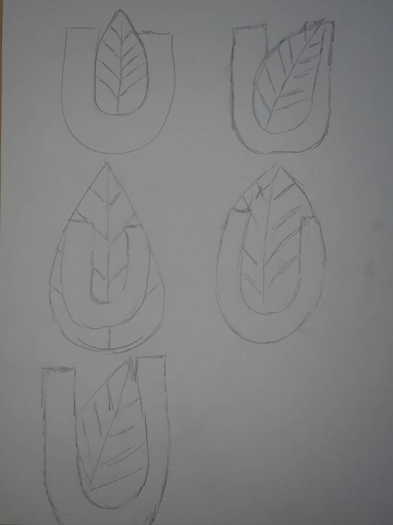
Closure
For this logo, I played around with the U balancing on the earth, I settled on having it on the right side, making an open space on the U’s right side. I simplified the earth from my original idea, it just got to busy in the little space behind the U.
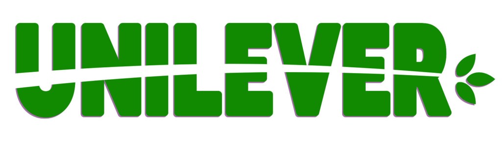
Continuation
Inspired by Unilever’s work against deforestation, I made a sprout go through the logo name. The three green leaves on the end, represent one of Unilever’s key priorities: Reducing, reusing and recycling. For this logo I chose a color of clear green, suitable with the leaves and forest theme.
Figure/ground
For this logo I wanted the U to be the background of the leaf, placing the leaf leaning towards the right preventing it from being totally symmetric and adding some edge to the design. I went with a bright green to color this logo.
Our second learning assignment these weeks is about understanding ideals. The task is to visit a popular store, and find answers some questions about the brand. I have chosen Ikea for this assignment. Due to the current Covid-19 situation in the world, and in Norway, I have decided to not go into the stores per now, I’ll probably do an update next time I visit an Ikea store(could be a while.) So this assignment is done based on their website and store, as well as my memories from visiting the store.
In 1943, the 17 year old Ingvar Kamprad founded Ikea, in Småland, Sweden. The name Ikea is an acronym based on the initials of Ingvar Kamprad, Elmtaryd – his childhood farm, and Agunnaryd – the nearby village.
What brand identity element are they using in their logo (e.g. abstract mark or word mark)?
The Ikea logo is a good example that simple is powerful. A blue rectangle as a background, the same blue color used for the sturdy capital letters, and a yellow oval frame. The yellow and blue, which are two of our three primary colors, is also the colors of the Swedish flag. This makes the logo a subtle hint about their proud background from Sweden. Blue is a color that we often associate with depth, trust and stability, yellow is seen to be a color for happiness, loyalty and freshness. Together these colors project trust, stability, loyalty and joy to us.
What do you think their brand ideal is?
Ikea wants to make good furniture at prices many people can afford. They keep their prices affordable by combining design, quality, function, value and sustainability. Most of the products are in flat packs, and ready to be brought home from the warehouses.
How do they remain true to their brand ideal within their shops?
At Ikea you find a wide selection of home goods, in a big price range, making it possible for everyone to find something new and modern for their home.
They have different sections in the warehouses, down to single products, in the living room section you find the armchairs together, which makes it easier to compare and find the one suitable for you. The area of the Ikea warehouse, you almost go through a planned maze, leading you all sections until you end up at the cash register. In the warehouses you find signs telling you where you are heading, you find maps, and they have placed workers station (help desks) and search engines around the warehouse, so you can easily find out where you need to go. For those wanting to just run through and grab the things they need, they have conveniently placed short-cuts between different sections. This also help us who tend to forget things we were supposed to buy, and need to go back. For the ones really in a hurry, you can order your stuff in advance, and they will be ready to pick up when you arrive. You can buy online as well, and pick it up at the post office or have it delivered to your house, depending on size and needs.
If you want to make a day of your Ikea trip, they have a restaurant/lounge area, normally placed in the middle of the warehouse, great for a break and something to eat before you continue planning for your home. Here you can buy dinner, like their famous swedish meatballs, grab a sandwich, or maybe some desserts. You can also just relax in a sofa, and even charge your phone before going back to shopping. The nice thing about these areas is that they are similar, actually almost alike across stores, so you can relax instantly, in the familiar feeling you get, even when going to a new Ikea.
In the Ikea warehouse you also walk by different environments. They build up rooms in all kinds of styles, which communicates to different target groups. You can find rooms expanding from a stylish lounge, walking past a romantic bedroom, and ending up by the modern kitchen of your dreams. These rooms, and sometimes combined rooms to look like small apartments, are filled with great ideas and practical solutions for our homes. They present the items with tags telling you the price, and where to find the objects. You actually get details all the way down to the color code of the walls.
Both in-store and online you get to meet their designers or workers in «small interviews» or presentations on posters and on their webpage. This helps us understand and get to know the thought behind the product, and even builds a stronger bond with customers.
Ikea is quite good at communicating without having to talk person to person. All around their warehouse you find little folders or posters with tips on combinations or use for their products. We also find information about the sustainable choices they make while designing, producing and transporting their products.
Evaluate the customer experience according to the brand ideal.
Ikea has a loyalty program, called «Ikea Family,» this builds trust and engagement, and their customers who are members, get special prices and deals from time to time.
With their restaurant inside the warehouse, the small cafeteria after the cash registers,, several contact points through the warehouse and the childcare where kids can play and have fun while their parents shop, Ikea shows us that they care about us, and our experience as their guests. They help us with our needs to make our shopping trip as pleasant as possible.
Ikea tells us that it’s OK to change your mind! And usually offers a return for unopened and unused goods within 365 days. (Right now during covid-19, they have temporary stopped this, but adds the down period to the 365 days.)
The people working at Ikea is helpful and friendly, they help you with how to find products, reserve products that you can pick up, or helps you with any other questions you might run into going through the warehouse. Here you can also get help drawing the kitchen of your dreams, or maybe the ultimate wall cabinets for your living room.
Evaluate the visual display of the products according to the brand ideal.
Going through the warehouse, dreaming about the different set up in the rooms you pass, you notice that the warehouse is built up by first presenting the rooms and their big items, which is needs to be picked up either after you have paid, or in the self service section before the cash register. The closer you get to the cash register, the smaller and more decorative items. You’ll go past kitchen equipment, bedding, frames and photos, lamps and rugs before reaching your destiny of payment. And on the way you have probably have picked up some napkins, straws and scented candles, that you absolutely did not need. But it will contribute well with the new cozy look you are inspired to add to your home, after a walk through the warehouse.
For our brand identity weeks (4-5) we got three different learning activities. The first one is about understanding positioning. Here we go:
Assignment 1: Look at the following logos and explain in your own words what you consider their positioning to be.
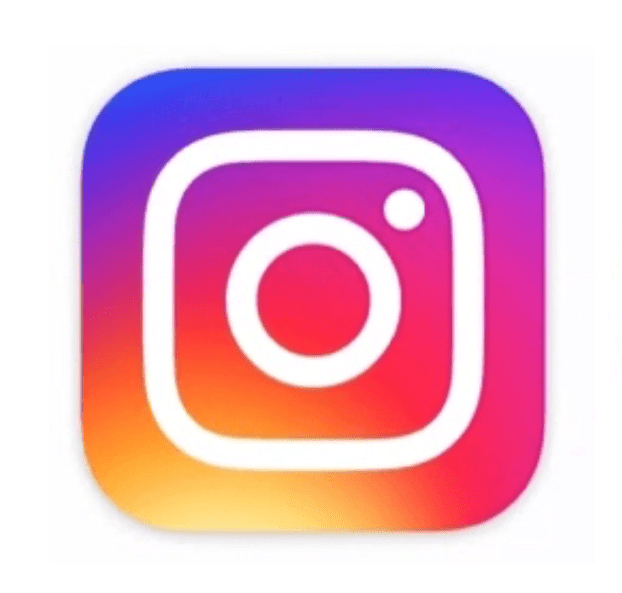
Instagram
At first glance, we see that the Instagram logo is a simplification of an analog camera. Much simpler in the shape and colors, than the one they used in the beginning of Instagram. The camera in the logo tells me that this is an app that has most likely something to do with photography. And it is not just a photography app, for many people, it is THE photography app. With all their add on, filters and different tools, their users are presented with an infinity of editing and sharing possibilities for videos and photography. And it is easy to use, just a couple of clicks, and you can have your favorite photo posted in the feed of people near and far.
The lines in the logo are rounded and soft, this fits in with the app welcoming all users, either you just got your first camera phone, or if you are a professional photograph. As long as you enjoy taking photos, the creative community of Instagram is waiting for your next inspiring post.
Looking at the colors of the Instagram logo, I get kind of happy, the colors are a playful gradient of warm colors, and I get associations to fun, youthfulness and joy. This tells me that Instagram want to make people feel welcome, no matter who you are, Instagram have something for you.
Mercedes
The Mercedes logo almost shouts high quality, the grey color gradient, that looks like stainless steel, has a promise of exclusiveness. The three pointed star combined with the circle around it, looks like a sleek simplification of the steering wheel on a car.
The lines in the logo are clean and sharp, and makes the shapes stand out as strong, and well balanced elements, in this symmetrical logo. Looking at the logo, it comes with a promise of quality combined with luxury.
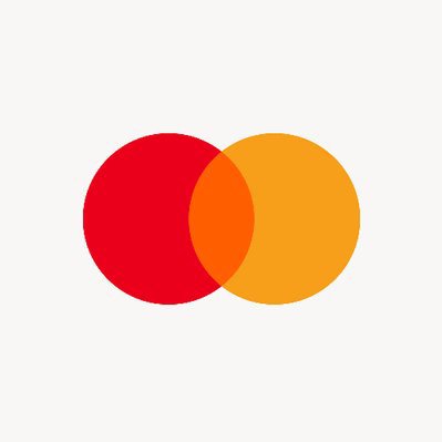
Mastercard
The logo of Mastercard is made up with two overlapping or connected circles, I think this come across as a symbol for unity. Knowing Mastercard as a credit card company, the circles could possibly be a simplification of coins.
Looking at the usage of warm colors in the logo, it tells us that it is friendly and trustworthy. The red color is often a symbol of strength, power and also passion. Yellow color could be associated with loyalty, positivity and happiness. The orange color in the middle is often representing enthusiasm, encouragement and success.
Being a quite simple logo, it appears open, yet combined, and could be a symbol of the bond between the bank and customer. It also tells us that this is not a complicated brand, in regards of becoming their customer. Mastercard is supportive, friendly, and cheers on their customers achieving their dreams.
Assignment 2: Look at the logo on the Apple iPhone and, by doing your own research, investigate the history of the product and the company that manufactures it.
Describe the iPhone’s brand identity – exactly as you see it
The iPhone with all it’s features and apps, is very much more then a phone to most of their owners, it can be seen as a ticket into a huge an innovative and creative community made up by iPhone owners. Some might even view it as an extension of their own person. iPhone is for people wanting a user friendly phone, which at the same time is quite exclusive.
Apples products have always had a very modern feel to them. iPhone being a stylish device, with many great functions, appeals to people wanting and appreciating good design and functions. If we add the service of them getting upgrades, and evolving new, faster and better phones, along with their users needs, this adds an emotional bond for their customers. And emotional bond creates enthusiasm, enthusiasm creates loyalty, which again sparks new purchases and keeps people in the happy community of iPhone users.
What do you think its positioning is currently?
I think iPhone is reaching out to modern, creative people, with the love for simplicity and good design. It appears accessible for all, yet unique and different.
What do you think the strategy for this specific product was?
I think the strategy for iPhone was to be a product extending the person it belongs to. It is a innovative product striving to be revolutionary in the smart phone market, and at the same time being simple to use for everyone. They build loyalty by upgrading and innovating the iPhone to keep up with their users needs and wants.
What research do you think was done on this by the company who made it?
I think in the development of the iPhone, there probably was a lot of research in what was missing in their customers lives. We often do not know what we need or want before we have it in hand. Take the iPod as an example, it quickly became a «must have» for music lovers on the go, adding different ranges as time went by to fit newly discovered needs.
At this time phones became more and more advanced, and we also carried around more and more devices in our pockets or backpacks. Many of us had at least a music player, digital camera and phone. At some point someone must have had a great idea about combining these items into a phone. And here we are, our phones advancing by the minute to fit our different needs.
Assignment 3: Take the same product as in assignment 2 and explain, in your own words, how the visual element (in this case, the logo) fits in with the brand identity.
The logo of Apple is a real evidence of the power of simplicity. The logo of Apple we know today, was made by Rob Janoff in 1977. For many years it were striped with the colors of the rainbow, before in 1998 it became single colored with different effects. The apple has been taken a bite of, this could be a play on words regarding byte in a computer. It is also said to have the leaf on top as well as the bite, so people would not mistake it for a tomato.
Apple’s logo is unique and easy to remember, it also plays very well with apples being associated with knowledge and intellect. This fits very well with Apple’s products, and specially this assignments product: the iPhone. A smartphone, chew on it for a moment, a smart phone. A product designed with clean lines, aesthetics that pleases the eye. And at the same time this product is so simple and intuitive, that anyone can understand how to use it.
It seems that no matter what product Apple makes, the elegant and modern design is combined with simplicity. This appeals to all people appreciating good design in company of user friendliness, making it quite an unbeatable combination. If we look at the logo again, we see that the logo is made in the same way. Good, elegant and modern design, combined with simplicity. Perfect match.
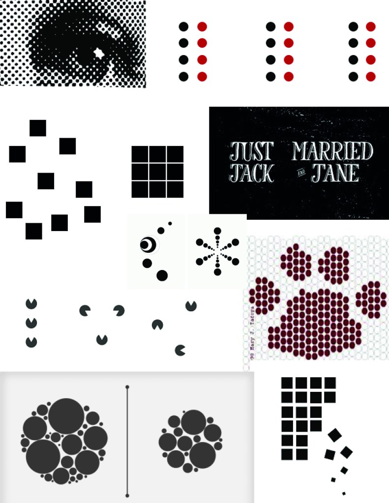
In this assignment I have researched the following eight principles: figure/ground, continuation, closure, proximity, similarity, symmetry, common fate and prägnanz. The assignment also said to choose three of them, and create illustrations for each one by hand.
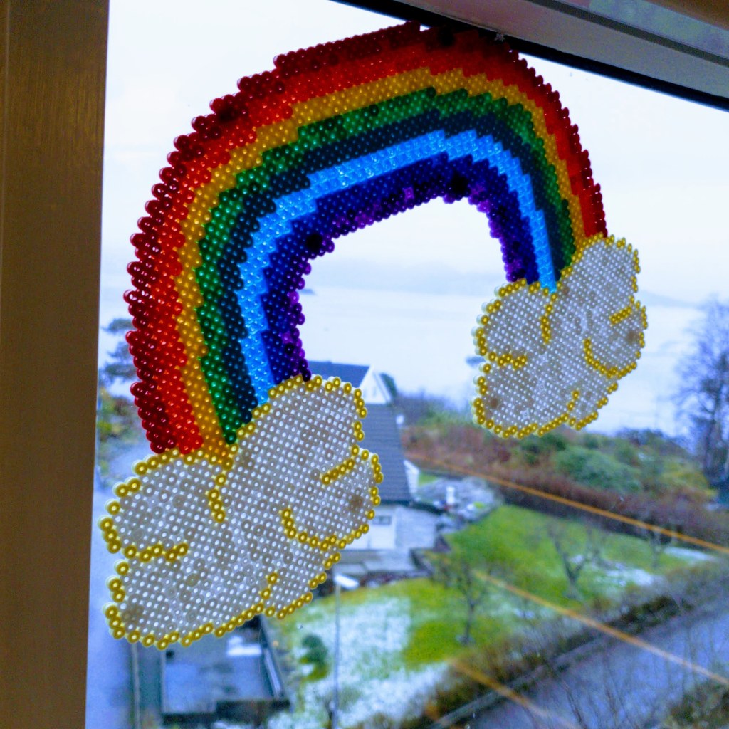
In addition to the given resources: pencil, paper and knife, I have mainly played around with paint and collage techniques. I have made several moodboards, sketched with some help from my five year old daughter, and tested out some of my ideas. Being home a lot with my kids, I noticed that a lot of my inspiration is a bit on the childish and colorful side, but do not worry. I have already made a rainbow these last weeks, so a rainbow is not included in my items, although it is very bright and quite symmetric hanging in my window.
For this assignment I have spent a lot of time online, searching Google and Pinterest, reading a whole lot of articles and collecting photos I found inspiration in. Due to the Covid-19 lockdown in kindergarten, I also have been outside a lot with my kids, walking and looking at my surroundings. I have sketched a lot, and also have received some help in coloring them (before I got the chance to take a photo of them.)
One of the first things I had to do for this assignment was to make sure I understood the different principles we were supposed to research. These are my findings:
Figure/ground: We tend to see the figure(foreground) first, and then afterwards we identify what is in the background.
Continuation: We follow and float along with lines, both visible and invisible.
Closure: We prefer to see whole shapes, and complete lines, and fill in openings in or between elements to see the figure as a whole one, instead of seeing pieces.
Proximity: We group elements that are close and related into a unit.
Similarity: We seek out the variables and similarities in a image or shape, and link the similar items together.
Symmetry: We strive for balance in designs, looking for elements being alike on both sides of an axis.
Common fate: We tend to see objects moving in the same directions as a group.
Prägnanz: We like to see complex and advanced shapes and images as a simpler whole.
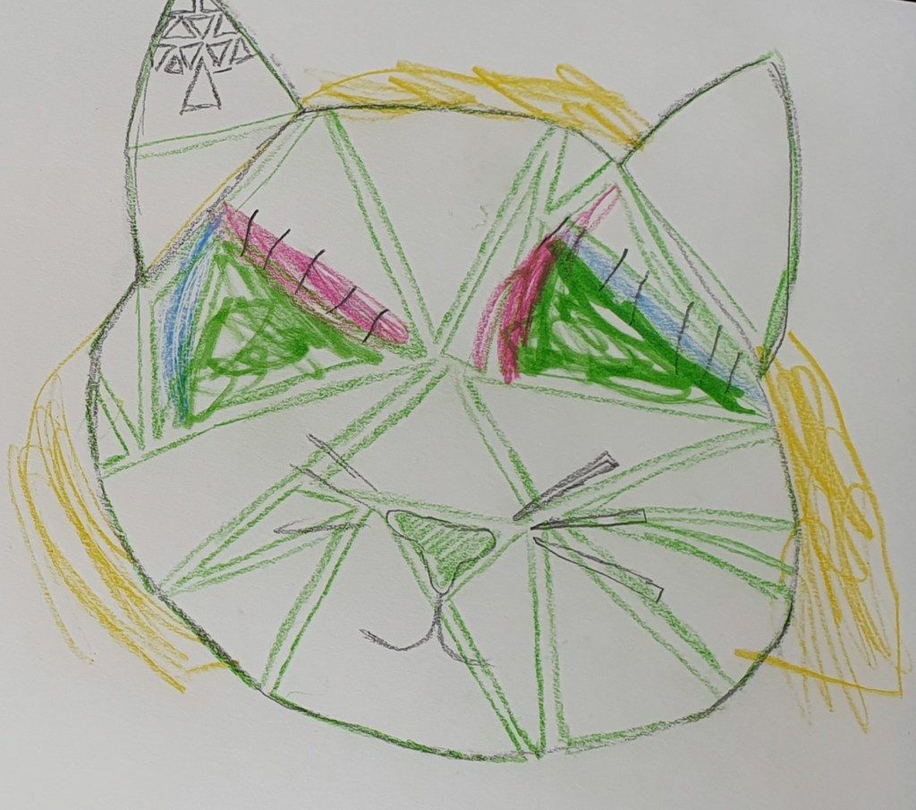
After countless hours online, I made my moodboard for each design principle and started sketching out the three that spoke to me. I chose Common Fate, Symmetry and Proximity. When I looked at my ideas and sketches, I really liked the cat sketch, but realised that it would look better with Similarity instead. So I discarded Proximity and chose Similarity.
1. Figure/Ground 2. Continuation 3. Closure
4. Proximity 5. Similarity 6. Symmetry
7. Common fate 8. Prägnanz
The assignment told us to use paper, pencil and a knife. We could also choose any other relevant materials and tools. Our end items should have the measurements of 25 cm x 25 cm, this being quite hard to achieve with regular a4 paper. The solution to this were to go out and purchase a3 paper, both sketching paper, and drawing paper. In addition to the paper, pencil and knife, I used matte and glossy paint, a paintbrush, a tiny paper scissor, glue, an old magazine, a ruler and my lightboard.
I painted samples with my matte and glossy paint on my drawing paper, then transferred my patterns onto the papers, and cut out. I also used cut outs from an magazine for my similarity item, this to add a bit of contrast to my colors and materials.
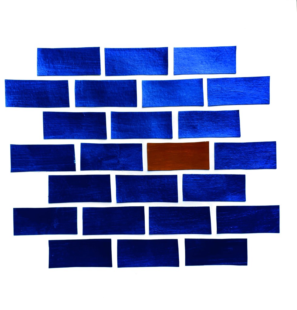
Common fate
My first item is made after the design principle common fate, I tried to keep my work simple without repeating or copying the photos I found during my online search. I thought about doing a piece like my self portrait, that I did for my learning assignment about my journey here, but this is a technique I want to explore and take further with programs like Photoshop and Illustrator, so it will have to wait for another time. Then I thought about Bricks in a wall, they usually all go the same way, and therefore is viewed as a whole unit, even without slabs of concrete in between them.
Traditionally brickwalls are terracotta red, with grey concrete in between. As an illustration I wanted it to be a bit different, and tested out the combination of the complementary colors blue and orange. I ended up with a bit more yellow hue, when choosing the color ochre in matte paint, but combined with the color metallic blue which is quite shiny, I thought the effect of them together were good. The ochre brick adds a focal point for my illustration, and prevents the item from being to monotone.
I made my bricks to the measurements of 2,5 cm x 5 cm, and the spaces between should be 0,5 cm. I placed them in a 3-4-3 formation on my paper, starting and ending with a row of 3, to prevent it from being unbalanced or to top/bottom heavy.
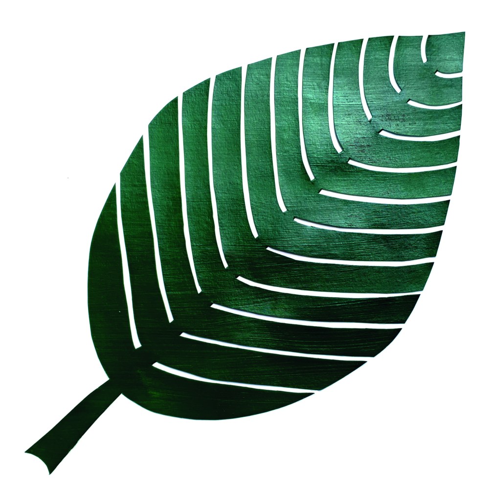
Symmetry
My second item for the Symmetry principle, is a huge green leaf. I was thinking about different ideas, one of them being a rainbow, which can be quite symmetric. During the last couple of weeks, with the Covid-19 situation, the rainbows are everywhere. So I have already made a rainbow with Hama beads, and then I wanted to do something different.
A green leaf is perhaps not the most innovating choice, but I chose to do the leaf anyway, due to the challenging small gaps in the leaf, and the beautiful contrast between the green leaf and white paper.
I chose this color of green paint because of the richness of the color. As for my common fate item I could have chosen a unexpected color and experimented, but for this one I wanted to keep it more on the basic side, and still get an effect of the dark green against the crisp white of my drawing paper. The green is painted onto a big sheet of paper, I transferred my drawn pattern onto it, and cut away.
I placed my leaf in the middle , turned diagonally across the paper, to avoid it from being to symmetrical. So this is my symmetrical yet unsymmetrical green leaf.
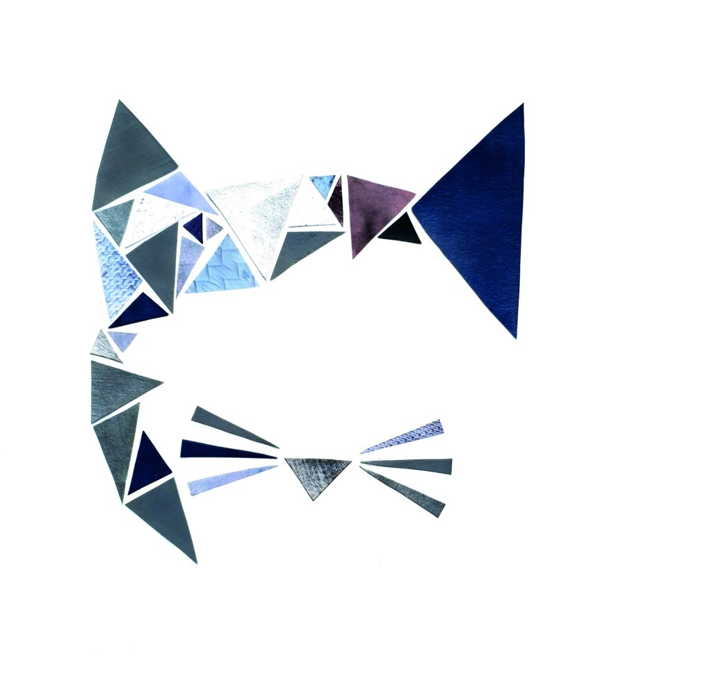
Similarity
My third and final item is a cat made out of triangles, for the similarity principle. As I mentioned before this initially started out as a proximity sketch and idea, but when I started drawing it up more detailed, it appeared to me that my idea actually was a similarity idea, not proximity, so I changed it.
The color choice for this illustration is different hues of grey, from light silver, to a dark grey. Most of my greys are a bit on the blue side of the color scale, adding depth to the illustration. I painted four different greys on my paper, as well as a see-through with grey glitter inside. For extra variation I cut out different items in grey from an old magazine, some of these have patterns on them, making them extra fun to add contrasts to my cat. I then cut out all my large and small triangles in different colors and patterns, and started gluing them on my paper, in my predefined pattern.
The different greys work well together, adding a bit of whimsicality to the strict triangles.