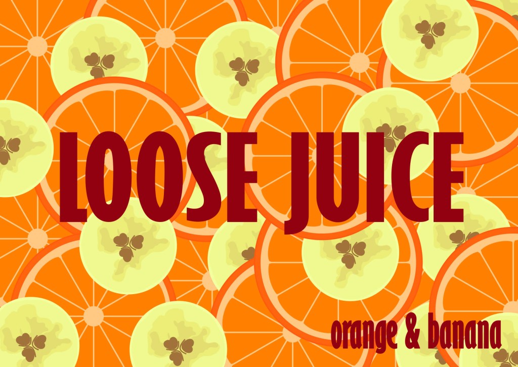
Our assignment this week told us to do an illustration for a fruit juice package, the product name is Loose Juice, and it has an orange and banana flavor.
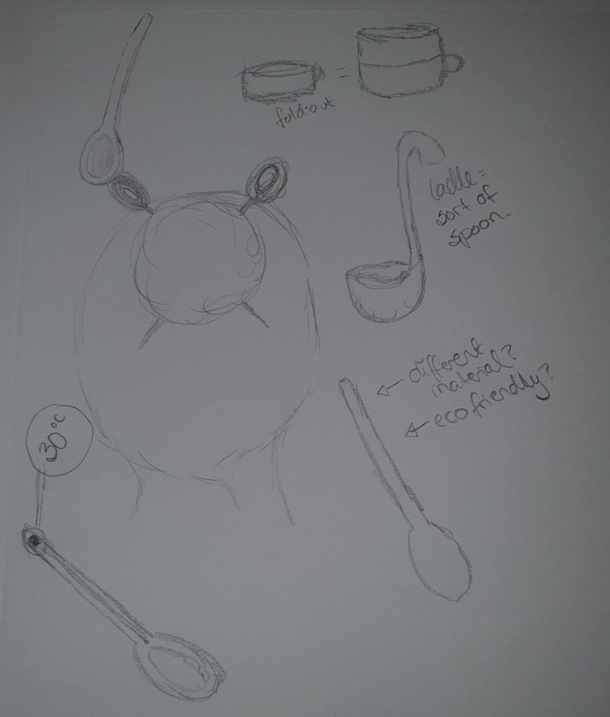
Our assignment said to draw up at least 15 scamps in A6 size, with our label ideas. Then we needed to choose one of our sketches and draw the label in Adobe Illustrator, and let me just say: Hello new world of fun! I have been dreaming about different Illustrator techniques and ideas all week, and although I see that it will take a while to master all the things Illustrator can do, at least I have dipped in. All has not been easy, but that is part of the fun when learning something new.
I started out doing a mind map around the name and content of the juice, playing with words and having fun.

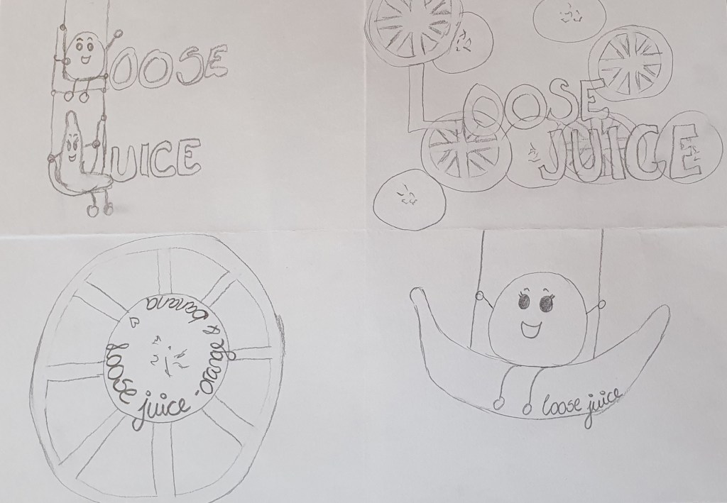
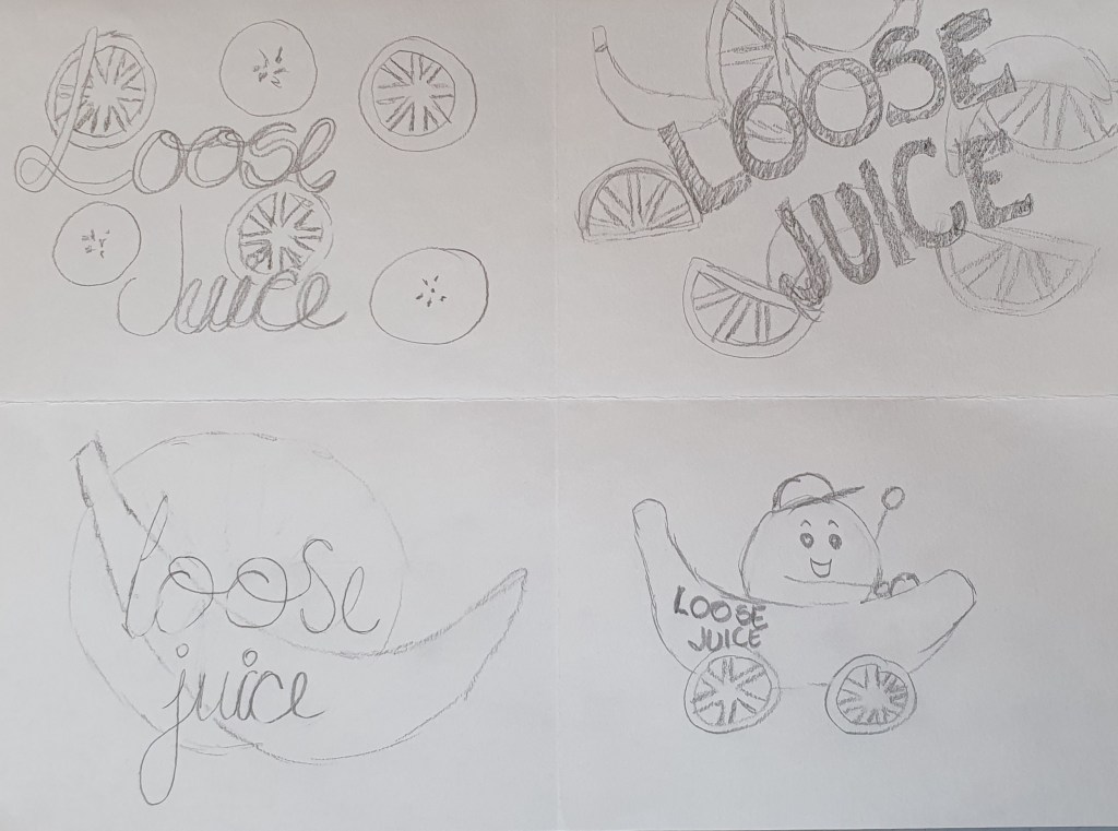
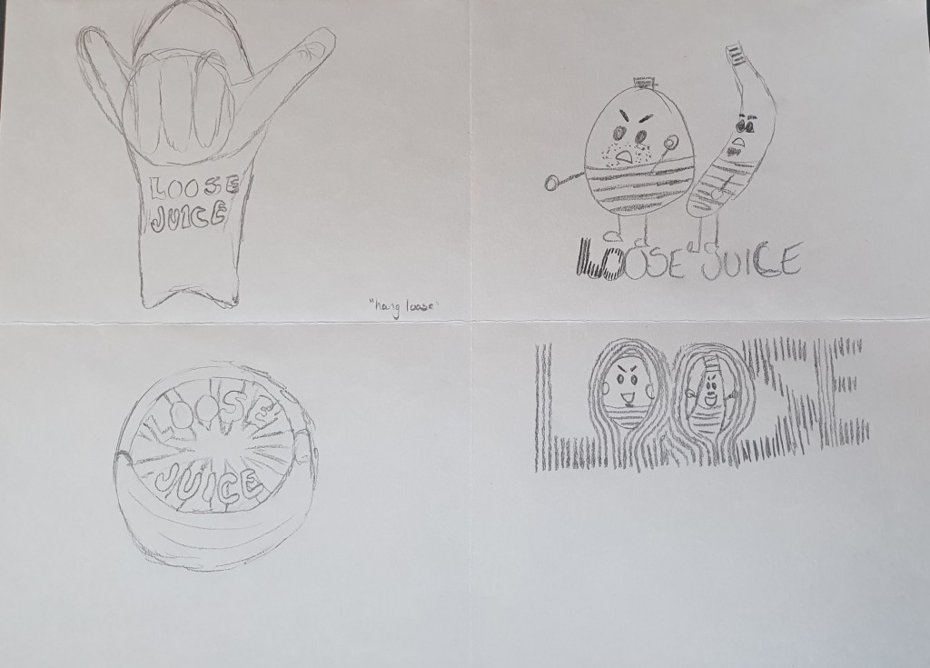

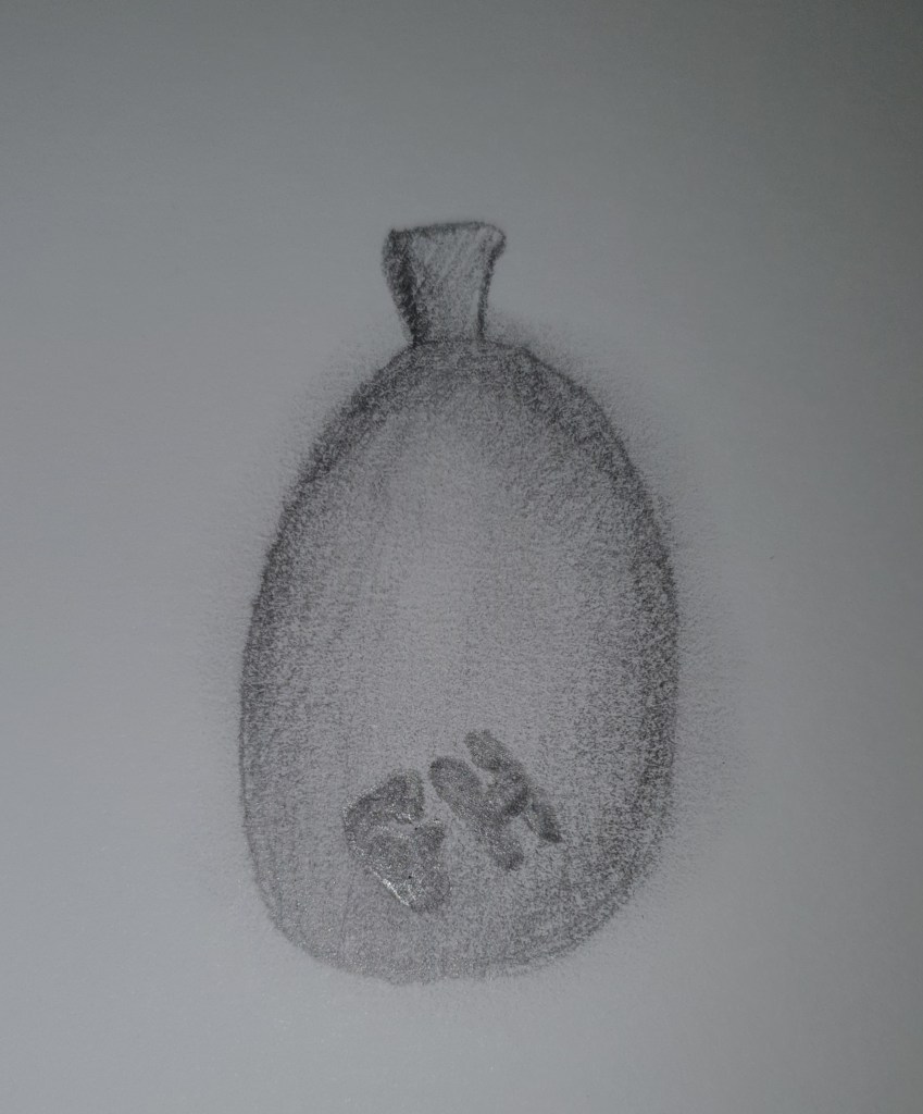
When doodling and sketching, I tried to make different themes for my labels, especially playing off the words I got in my mind map from loose. The one playing out from the hang loose hand move, suddenly popped in my head when going to bed one of the first days, and it were a favorite for a night, until I got it on paper. The orange and banana together should form the hand. When on paper, I got unsure, and worked with more ideas.
After working and testing for hours, over several days actually. At one point while testing, my banana actually looked more like a world map than a banana. Initially I imagined white text on my sliced fruit, but the white dis not work at all. I also found out that a soft, maybe almost handwritten font, would not work. All the round fruit slices, tossed around, needed a bit of structure, and I went with the font Gill Sans MT Ext Condensed Bold. With my white text failing, I tested out different options, in the end I chose this dark red color, which stands out in front of the fruit, but also complement them well. Now I have a label which almost has a little retro look, I think it is my color choices, but I also kinda like it. My label for Loose Juice ended up like this: